Well that didn't take long. In just a couple of years, we content marketers have done a heck of a job painting ourselves into a corner. Several corners, actually.
Our penchant for snappy axioms—most of them a derivative of "set content free"—has put content marketing on a collision course with otherwise sensible business objectives.
When I ran content strategy at a large marketing technology vendor, I was a purist. I felt that content should never be "locked" behind a form, that credibility demanded the brand's logo be "zeroed out," and that embedding even the subtlest sales message was a cardinal sin.
I was a purist because I could afford to be. Because of my employer's size, momentum, and diversity of marketing programs, we didn't have to force readers to complete a form to download an e-book or video. We didn't examine each content expense in the same way a small or early-stage company must. The luxury of time granted us the freedom to trust that those who valued our content would be more likely to buy from us when they were good and ready.
At an early startup, however, time and money reign supreme. Its marketers must find ways for all content—even creative assets such as infographics—to generate business, not just buzz. Every investment must advance the company.
So when I joined a mobile technology startup called Kinvey as VP of marketing, I quickly realized that I had been perpetuating a series of false choices. The content marketer in me had been at odds with the lead marketer in me.
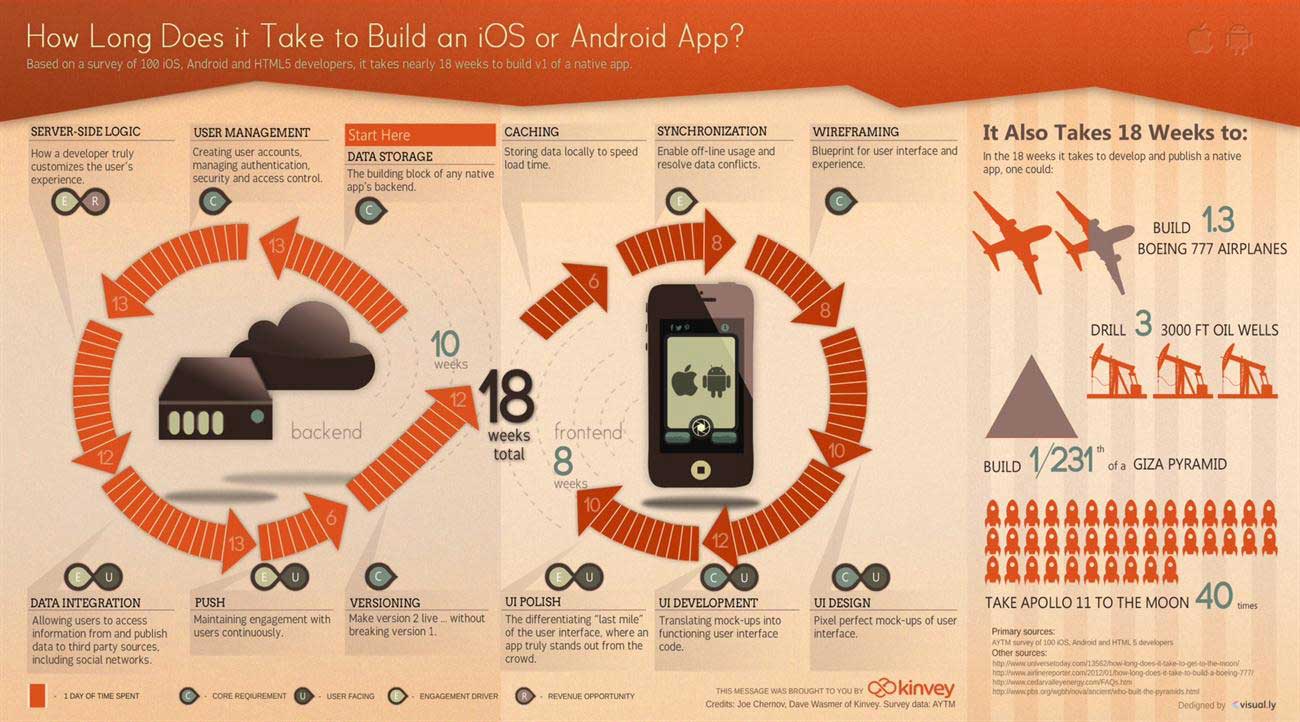
I now hope to set the record straight, using as an example Kinvey's latest infographic, "How Long Does it Take to Build an iOS or Android App?"
On the surface, it's a fairly straightforward infographic: a reasonably pretty picture, just confusing enough to force you to spend a few extra moments with it; a few surprising data points to provoke sharing; and lots of citations to reduce the risk of being flamed.
But, for me, what makes this infographic different is what it doesn't contain: false choices.
False Choice One: Large logos are bad for credibility; small logos are bad for branding. Pick your poison.
For top-of-funnel content, I still believe the size of one's logo is inversely proportional to the credibility of the content. That's why the Kinvey logo is among the smallest images in the graphic—so small, in fact, that it would be easy to miss.
But a logo is just one expression of branding, and the company's fuller branding can be felt throughout. An infinity symbol (the cornerstone of Kinvey's logo) serves as the central design element for the entire graphic. Smaller infinity symbols are sprinkled throughout the image, reinforcing the central theme. And the title section mimics the hero unit on the Kinvey website.
In other words, though the logo is small, the branding is pervasive.
False Choice Two: Content can either help or sell. It can't do both.
Kinvey helps mobile application developers cut in half the time it takes to build an app by providing them with an entire "app backend" (basically the app's technical "plumbing") in the cloud. As a start-up we are not in a position to churn out an infographic a week, so picking the right topic was critical.
We could have gone the "helpful" route and created something like "How to get approved by the AppStore," which, though it might have spread, wouldn't advance our corporate message. Alternatively, we could have selected a more sales-oriented theme that centered on our value proposition, but that would have a very limited appeal.
Instead, we compromised by creating an infographic that helped our audience anticipate how long it will take to build each aspect of their future app, and tacitly sold Kinvey by implying that we can help reduce the time investment.
False Choice Three: "With a form" and "without a form" are your only distribution options.
Obviously, nobody should put an infographic behind a form. Infographics are designed to spread organically, and a form naturally impedes that objective. Yet we can't afford to invest in content purely for brand awareness. We need to attract developers to try our platform.
Accordingly, we solicited input from companies with a complementary value proposition... throughout the development of the infographic—so that they would be intellectually and emotionally "bought in" to the finished product. Then we equipped each of these organizations with the graphic and a landing page on our joint value proposition.
These partners are now sending the infographic to their developer community, complete with a link to the custom landing page where developers can sign up for Kinvey. It's like putting the ATM next to the cash register.
* * *
Those three challenges aren't the only ones content marketers face, nor are Kinvey's tactics the only ways to overcome them. In the end, success often comes down to identifying traps you have inadvertently set for yourself, and finding a way around them.
What false choices do you find yourself making in your content marketing program?


