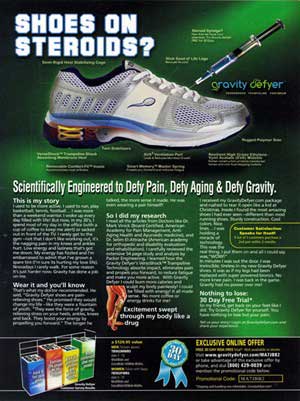
When I saw this ad in a magazine, I thought it was a joke. A parody, a satire, a lampoon... anything but what it really is—totally legit and serious.
If ever there was a marketing message completely unaware of the modern zeitgeist, and offensive to boot, this ad is it!
At a back-breaking stretch, it might be suitable in a magazine catering to the dark underbelly of "enhanced" athletic performance.
But this ad appeared in Biblical Archeology Review, which has a readership composed of Christian and Jewish scholars, Near Eastern archeologists, and all others who have an abiding affinity for anything buried in Israel.
So the ad may work—if the above are also unrepentant heroin addicts. If not... these marketers are in serious need of rehab!
Here's Where the Ad Tanks
1. The headline: "Shoes on Steroids?"
In a pinch, I could actually live with the concept behind the headline, if not the actual wording. Stating that something is on steroids is a common and popular way of implying that the object is powerful, strong, and unbeatable. So I really have no problem with its usage.
But why make it a question? It could be that the copywriter was trying to engage the reader—to force "reader involvement." But by not setting up the question with a thought-provoking or emotionally compelling pre-head or sub-head, it's ineffective. In other words, as is, the headline needs explaining and a context. Using an exclamation mark, on the other hand, would've made it a declarative headline, and hence more powerful.
2. The Imagery: Sticking a syringe full of steroids into a shoe...
Gimme a break! My first reaction upon seeing a needle inserted into the tongue of the shoe (and, by association, into the fleshy, vulnerable top of my foot), was to wince and groan, much as if I had swallowed a warm, rotten oyster.
And to think that (athletic or not) people of any age would be impressed, persuaded, and compelled to buy a pair of shoes that are depicted as steroid junkies... is, in my opinion, a drug-induced delusion (more on that later).
Apparently, no one who vetted this promotion understands the importance of market research, much less the effect that words and images can have on their intended market. And I won't even begin to speculate on what possessed them to use a sperm cell as a shoe logo! OK, let's not belabor these graphic missteps any further—there's far more to critique here, and learn from.
3. Weird Features and Weirder Benefits
Surrounding the shoe are snippets of copy that point to and highlight the shoe's features and supposed benefits. Some of this copy works, some of it doesn't, and some of it is absolutely inane.
For example:
- "Slick Seed of Life Logo" (referring to the sperm shape)—"because it's cool." Now that really makes me wonder whether the marketing director is, in reality, a smirking high school prankster who enjoys Biology 101 for all the wrong (and typically adolescent) reasons.
- "Steroid Syringe? Now that we have your attention. Try Gravity Defyer FREE for 30 Days." Apparently, bait and switch carries no weight with this high schooler.
- "Scientifically Engineered to Defy Pain, Defy Aging and Defy Gravity." In fairness, many marketers make similarly unbelievable claims of equally stupendous magnitude. A gullible and sleepy public may let this sub-head slip (though why the FTC would is another question). But who in their right mind would ever believe these shoes can actually defy gravity? I mean, come on!
By the way, if you ever make an astounding, utterly remarkable, and earth-shattering statement—emphasize it with an exclamation point. That's what they're for. Yet, the totally bewildered folks at Gravity Defyer employ a period instead, which in an ad is never used in a headline, subhead, or bullet point... because a period is akin to a stop sign. And you don't want to stop the reader from reading.
The Bright Side
Remarkably, the marketers do understand the power of a story. The ad's body copy is a story told in the first person singular, about how a person benefited from wearing the Gravity Defyer. The writer even names two doctors who recommended these miracle shoes.
All in all, a sophisticated, credibility-building approach.
But it's all ruined when in a subhead the person proclaims: "Excitement swept through my body like a drug." Why these marketers think their readers worship at the altar of illicit drugs defies all understanding.
Worse still, the person telling the story is never identified. Therefore, as an unattributed (and supposed) case study, it lacks credibility. The jaded, untrusting, and wary reader (aren't they all?) will quickly discount the entire narrative as pure fiction—as undoubtedly it is.
Note: Always place a name—even better, a face—on stories and testimonials.
The Final Sin
There's no guarantee, and no wonder, since these shoes can defy gravity. Well, actually, there's an implied guarantee—but it isn't clearly defined. Instead, there is a blue ribbon award graphic touting a "risk free 30 day trial," which is also repeated in other places, but its terms are not stated. An explicit and powerful guarantee is non-negotiable. Every promotion must have one.
And finally...
A Word of Praise for the Designer
The designer of the ad did an excellent job. The ad is easy to read (though the type size is too small in places), easy to follow, and easy to absorb. And the use of a percentage chart is a nice touch, as is the demonstrative spring-loaded leg cutaway.
Clearly, the design is not the work of a beginner looking to build a book of samples. I can only wonder, therefore, what possessed the designer to accept the assignment. I would imagine that the ad, as a whole, is not exactly something he or she would want to include in a portfolio.


