In my former job, my title included "Director of Best-Practices." It was a description that made sense at the time, since my role was to offer clients best-practice advice on all things email marketing.
However, as time went on, many of my discussions with other industry folks got me thinking. What are best-practices?
A colleague, Loren McDonald, likes to refer to best-practices as "generally accepted best-practices." According to Wikipedia, a best-practice "is a technique, method, process, activity, incentive, or reward that is believed to be more effective at delivering a particular outcome than any other technique, method, process, etc. when applied to a particular condition or circumstance."
OK, I buy that definition. Another way of saying the same thing is that a best-practice is the generally preferred practice, one that will make your company more money, thus making your boss happy, which in turn will make you happy.
If it were only that easy.
In the past five years, I've been giving email-marketing best-practice advice to prospects, clients, partners, coworkers, and, frankly, anyone who would listen.
One of the most common questions I'm asked starts with, "What is the best-practice for...?" For example, "What is the best-practice for subject-line length?" or "What is the best-practice for day or time to send?" or "What is the best-practice for copy/creative length?" The answer inevitably goes something like this:
"Well, the ideal subject-line length is between [insert range] characters but that really depends on what delivers the highest number of opens/clicks/conversions... for you."
In other words, we can find and spit back best-practices for most email-marketing-related questions; however, I nearly always find marketers who "break the rules" with tremendous success.
Why? Often they have tested and found that their subscribers respond better to a practice that is not considered "best." When I think of not following industry best-practices, five examples come to mind.
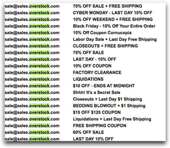
1. Overstock.com: ALL CAPS IN THE SUBJECT LINE
If you've ever received an email from Overstock, one thing jumps out.
The subject lines are, often, IN ALL CAPS. Some subject lines read "BEDDING BLOWOUT" or "CLOSEOUTS" or "FREE SHIPPING COUPON."
Now, industry best-practices would tell you not only to never use all caps but also to avoid the word "free" (that is now a bit more debatable). However, it works for Overstock.
I had the chance to meet a member of the Overstock email-marketing team, and he informed me that they have done (and continue to do) extensive subject-line testing. Those types of subject lines you see above outperform the others... by far!
Will that technique work for you? It depends.
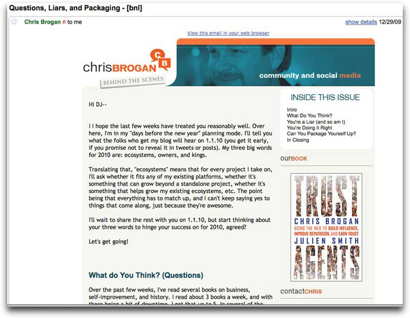
2. Chris Brogan's Newsletter: A Whole Bunch of Text, Few Links, and No Clear Call to Action
(Disclosure: Blue Sky Factory designed Chris Brogan's template, and Brogan is a client of BSF.)
Chris Brogan sends out a newsletter that, with the exception of a few call-to-action buttons and logos, and the Share With Your Network (SWYN) feature, is all text.
Although industry best-practices say that email copy should include opportunities for people to click,
Brogan's open rate is far north of 50%, and he consistently extends his reach by double digits through SWYN; moreover, he often gets hundreds of replies thanking him and asking follow-up questions.
If that isn't engagement, I'm not sure what is. So, again, the practice of sending mostly text emails works... for Brogan and his subscribers.
Will it also work for you? It could.
3. Marketing Over Coffee: Ugly vs. Pretty Template Test
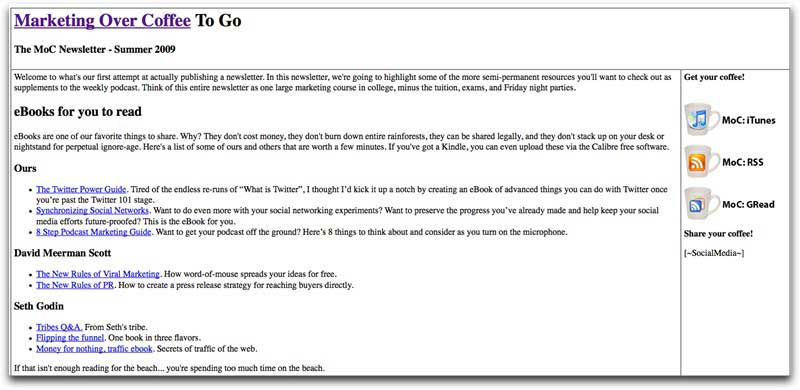
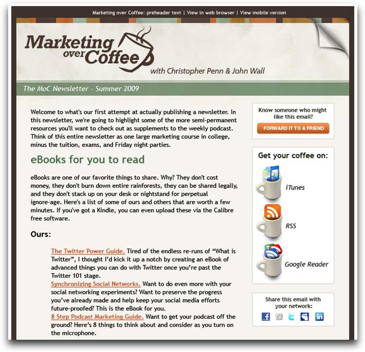
In September of 2009, Blue Sky Factory Client Service Manager Joanna Lawson-Matthew ran an experiment to see how a text-heavy, design-light (i.e., ugly) template would perform against a Blue Sky Factory–designed, polished, professional, industry-best-practice (pretty) template.
The client was Marketing Over Coffee, a weekly podcast that discusses both classic and new marketing, hosted by John Wall and Chris Penn. (No longer a client, Penn recently became the VP of Strategy and Innovation for Blue Sky Factory.)
Original (Ugly) Template:
New (Pretty) Template:
Suffice it to say, holding subject line, from name, email content, and date/time of send constant, the open rate and click-through rates of both the old and the new template were nearly identical. (For the full details on the results of the experiment, see "Marketing Over Coffee: And The Winner Is...")
Should you be sending a text-heavy (ugly) template? Maybe.
4. Apple: One Big Image
Apple fans are everywhere. Many would argue that Apple can do no wrong when it comes to innovation, design, product launches, and marketing.
I'll let you be the judge of that; however, I can tell you that one of Apple's email-marketing tactics that does not follow industry best-practices is its use of images.
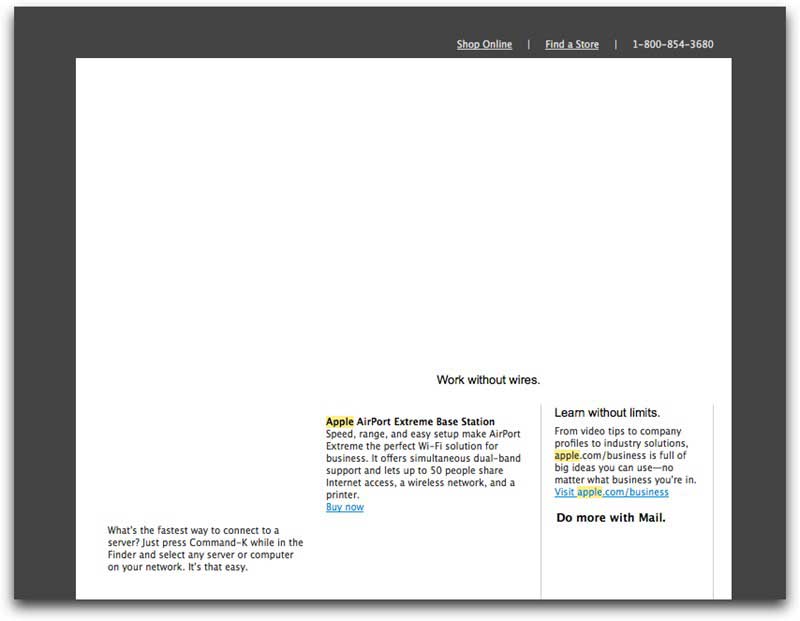
Nearly all its emails lead with a big image. Best-practices would tell you that is bad. (I'll leave the deliverability side of this conversation out for now.) Far too many email clients (and users) have images off by default. So, when the Apple email lands in your inbox, it looks like this:
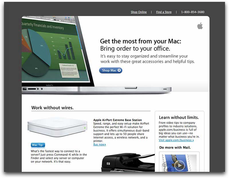
See the problem? The entire top of the message is blank. To make matters worse, Apple does not even include alt text (alternative text) or the ability to click on a link. When you view the message with images on, below, you see a nice picture of a MacBook Pro as well as a call to action to "Shop Mac." With images off, Apple loses the potential click (and conversion).
So, what gives? How does Apple get away with that?
At the Email Evolution Conference in Miami in February, I was fortunate to meet two of the gentlemen who are responsible for email marketing at Apple. They said they're aware of the "one big image" issue and are looking to make some tweaks.
However, as they told me, their emails work. Why? Probably because Apple is such a trusted brand that subscribers are more likely to auto-enable images.
Does that mean you model your creative after Apple and include a big image at the top? Possibly.
5. Publishers Clearing House: Breaks So Many Rules (but Gets Killer Results)
In February 2010, Chad White, research director at Smith-Harmon, wrote "It's Not That There Aren't Best Practices..." in which he referenced my displeasure with the design of the Publishers' Clearing House (PCH) emails.
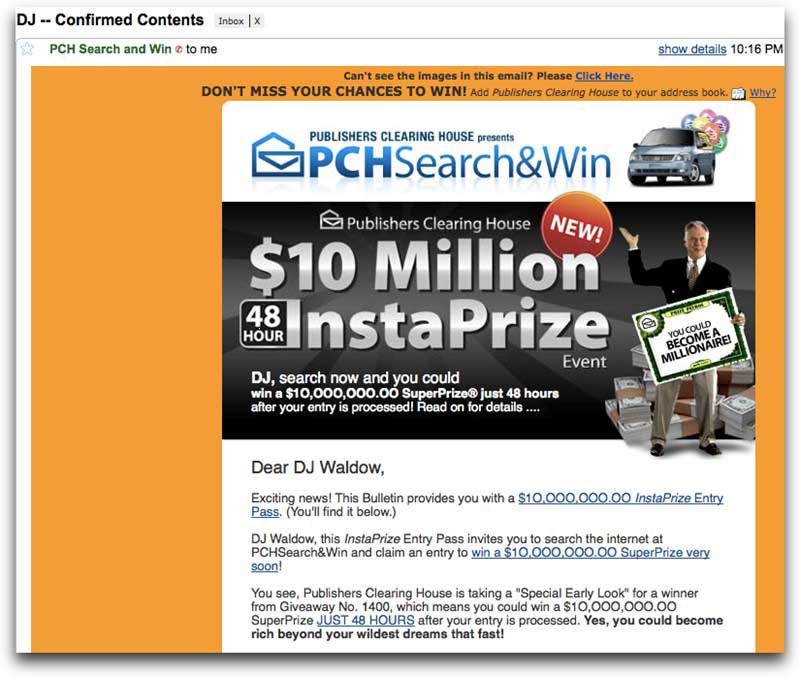
Here's an example. Below is the top section of a recent PCH email. (I've shown only the top portion, as the entire email would be seven times as long—another no-no.)
Yikes! The subject line includes my name (bad) and makes little sense (bad). The top portion is littered with big images (bad). There are too many flashing gifs(bad), caps (bad), and the letter O instead of zeros (bad). Overall, it makes me dizzy. It breaks just about every rule I can think of.
But here's the rub: It works. In fact, PCH emails do more than work. They have open, click-through, and conversion rates that would make any email marketer salivate.
I know because I spent a significant amount of time with Sal Tripi, PCH's senior director of operations and compliance. He agreed that PCH emails are not pretty and don't follow email-creative best-practices. However, they perform. They knock it out of the park. Sal's team has tested and retested—and these emails win, hands down.
So, should your emails look like PCH's? Yes—assuming you are getting the killer results PCH is.
* * *
Remember: The next time you hear "best-practice," ask yourself whether that practice is best for you and for your audience. Have you tested to confirm that the industry norm is really the best option? What does the data tell you? Are you maximizing your goals? Have you performed some split (A/B) testing to see whether the "anti" best-practice works better? Try it. I dare you.
