It's been a big week for Twitter! You'll get the skinny on all that, and you'll also learn about ideal social copy length for all major social networks, Facebook's new-and-improved right-column ads, and longer YouTube descriptions—not to mention all the ways #GameofThrones slid into your stream. Skim to stay informed.
This! is wholesome. On March 10, Honey Maid released a miniature documentary about a loving family led by a gay couple. The video received lots of positive response, but—as you might imagine—plenty of negative commentary, too. In response, Honey Maid printed all the negative comments out, and hired two artists to make something positive out of them. Then it surrounded that piece of art with all the positive feedback it received. At 2.6 million views for this video, and plenty of warm-cuddly vibes circulating the socnets, this near-crisis was a heartwarming social success.
A duel in the making. House of Cards, a Netflix original series, welcomed HBO's Game of Thrones back to television for Season 4... with an image of its own star, Kevin Spacey, in his role as Frank Underwood, on the coveted throne that symbolizes ultimate power in Game of Thrones. (It also included a hashtag with Frank Underwood's initials... or are they?!) We smell a challenge, and it might well play out on social.
Welcome back, @GameofThrones. May the best House win. #FU pic.twitter.com/khW0Hg3MXK
— House of Cards (@HouseofCards) April 7, 2014
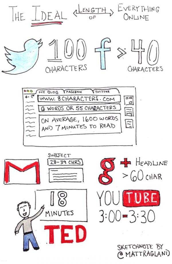
The science of your social copy's length. Fast Company dug around the Internet and compiled a list of "scientific" social media guidelines. Did you know that a tweet shorter than 100 characters scores a 17% higher engagement rate? Or that a Facebook post of fewer than 40 characters scores 86% higher engagement? NOW YOU DO. Below, a sketch one commenter made of this data:
Twitter gets a redesign! Twitter's revamping its appearance. After glimpsing at a few screenshots, you might find it a bit more... familiar. Like Facebook, it'll implement a wide cover photo across the top of user pages. The profile picture will expand and will be moved to the left with your data, making room for a middle column for your incoming tweets, and a right column for trending topics and other Twitter propositions. There's also the option to "pin" tweets to the top of your timeline, controlling what others see when they come to your page. In other words, it looks an awful lot like Facebook.
Check out @CarsonDaly's new @Twitter page! #OrangeRoom pic.twitter.com/M2xNL7TVgE
— TODAY (@TODAYshow) April 8, 2014
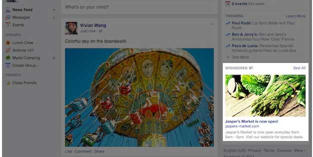
Facebook gives right-column ads a boost. Good news! Facebook's improved its right-column ads so they'll resemble News Feed ads more closely: They're larger, they match News Feed ads in proportion, and you'll see increasingly fewer ads on the right-hand side. In theory, all this should increase engagement (which News Feed ads enjoy much more of, simply because they're larger and look far more like organic content).
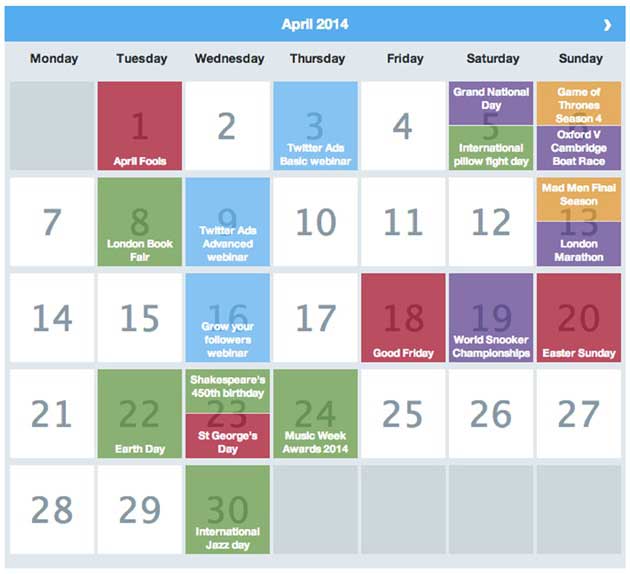
Time to #OwntheMoment on Twitter. Timely tweeting just got a whole lot easier. Twitter's releasing monthly calendars that highlight events such as April Fools, Earth Day, and others. When you click on one, you get example tweets and ideas for how you can plan tweets around the event. Toggle by seasonal, TV, sporting, cultural, business, and Twitter-specific events.
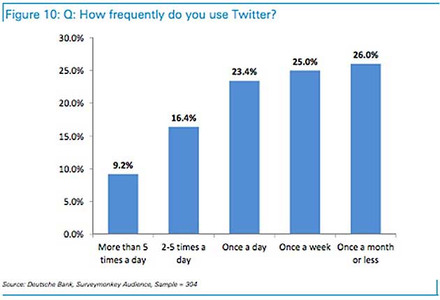
Are your Twitter ads user-relevant? A study from Deutsche Bank Securities Inc. found that nearly half of active Twitter users use it more than once per day—not far from Facebook's daily average use. And 51% use Twitter to find out about news and related events, making it a juicy "discovery" platform.
As for advertising, though, 60% of Twitter users say they've seen an ad, but among them 83% don't find the ads useful or relevant. If you're a Twitter advertiser, optimize its audience-tracking and real-time options to ensure your ads are as relevant as they can be. Few other marketers will make the effort. Also note that 76% of Twitter users access it via mobile, so create mobile-friendly content. If you're including a link, ensure the landing page is mobile-optimized.
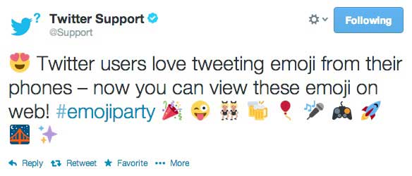
Welcome to Emoji nation. Twitter now permits the use of Emoji—you know, those "emotive" little images that long ago colonized texts, Instagram, and Facebook—in-stream. Before the update, Emoji would appear as hollow little boxes. This update also affects previous tweets that included Emoji... which will now be crystal-clear to you.
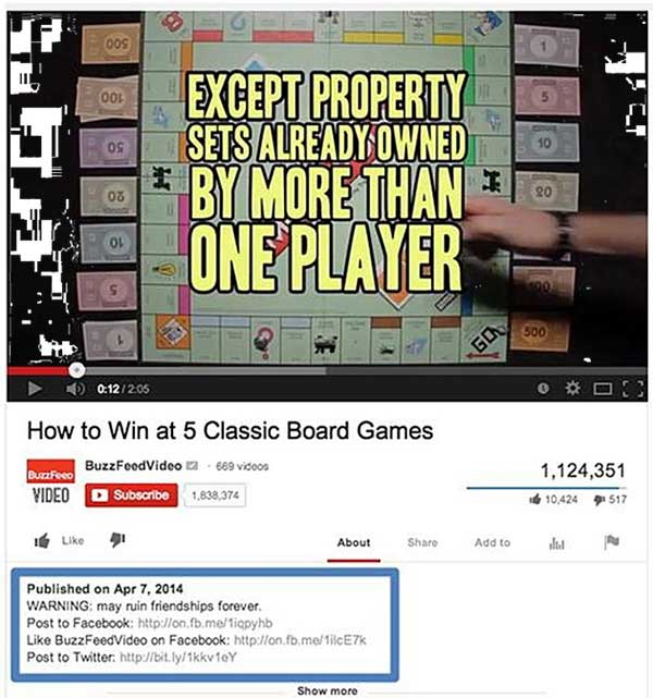
More breathing room in YouTube descriptions. YouTube's made a tiny change to its video pages: It's expanded the space dedicated to over-the-fold video text (description text that you see before clicking on Show More) from two lines to five. Now you've got more room to include crucial above-the-fold information, including a more conversational descriptions... and additional links, such as in this Buzzfeed video example:
We'll wrap by taking things back to Westeros. Hootsuite's created an awesome SlideShare presentation about the stakes in social media, the different companies involved, and how information flows between them (or doesn't)... by converting each social network into a "House" from the world of Game of Thrones. Seriously.
