Don't think too much about your business card? Then neither will your potential clients.
When creating a business card, keep in mind that it will be a memento in someone's wallet or purse to remind them of your meeting. If the card is sloppily put together, folks will remember you like that. However, if the card is clean, bright, and smart-looking, they'll probably remember you like that, too.
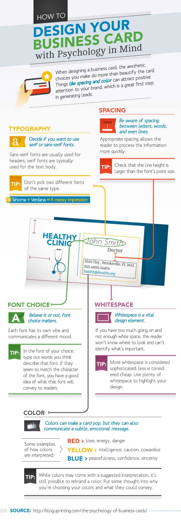
The following infographic by Online Business Cards from uPrinting highlights the top 5 elements of a well-designed business card.
1. Typography. Serif or sans-serif? Serifs are the small lines on the edges of a letter; sans-serifs are fonts without the serifs.
2. Spacing. Don'tcramallthewordstogether. As you can see, that was annoying to read. Don't do the same thing on your business card. Give your text space.
3. Font choice. Elegant, fanciful, straightforward, or handwritten? Your choice of typeface should convey the culture and spirit of your business.
4. White space. Make sure your business card isn't too busy with colors, text, and graphic. A too-busy business card confuses people, and they won't know where to look.
5. Color. The color you choose should convey the right emotional message. For example, red might convey love, energy, and danger.
Check out the following infographic for more details about crafting an engaging business card.


