The way people engage with Google search engine result pages (SERPs) has changed significantly over the past decade, according to a recent report from Mediative.
The report was based on data from an eye-tracking study of 53 participants who were asked to complete 43 common search tasks, such as looking for an apartment to rent in a particular neighborhood. All searches were conducted on desktop computers in Canada using the Google search engine.
A similar study conducted by Mediative in 2005 found that users tended to focus their gaze on the "Golden Triangle"—the top-left corner of a SERP where the first result was usually displayed.
The 2014 results were strikingly different from those a decade ago. The Golden Triangle has all but disappeared; instead, users tend scan more vertically and to vary their focus depending on what they are searching for.

This change in behavior is partially the result of the increased use of mobile devices, which have conditioned consumers to scan more vertically than horizontally, the analysis found.
The shift is also the result of changes Google has made to its SERPs. In 2005, the most relevant result was almost always in the top-left corner of the page, whereas today—because of new elements such as the Knowledge Graph, Carousel, and Local Listings—it can be more dispersed.
Below, additional key findings from the report.
The Impact of New SERP Elements
- With the addition of new elements to the SERPs, users now have a tendency to scan pages more quickly: In 2005, searchers spent just under 2 seconds, on average, viewing each listing; in 2014 that has dropped to 1.17 seconds.
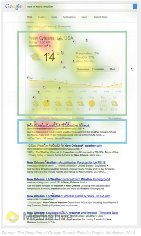
- The impact of a Knowledge Graph result—information displayed by Google directly in the SERP—varied significantly depending on whether or not the answer was relevant.
- Participants in the study often skipped irrelevant Knowledge Graph results and went straight to the listings below them. However, if a Knowledge Graph result was relevant, it drew away a significant amount of attention from the subsequent listings.

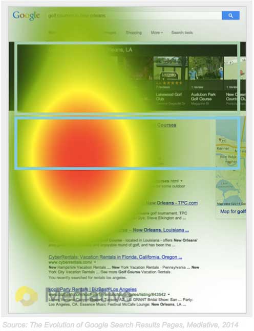
- Google's Carousel—a strip of images at the top of the page with accompanying information such as ratings—had much less of an impact on the subsequent results than did Knowledge Graph.
- In most cases, participants did not focus their gaze on the Carousel, and instead spent more time viewing the listings below the feature.
- However, the introduction of the Carousel did lead to more activity on the sponsored listings directly below. Sponsored listings on a page with a Carousel received significantly more attention (+136% increase in time spent) than did listings on a page without a Carousel.

The Value of Being First
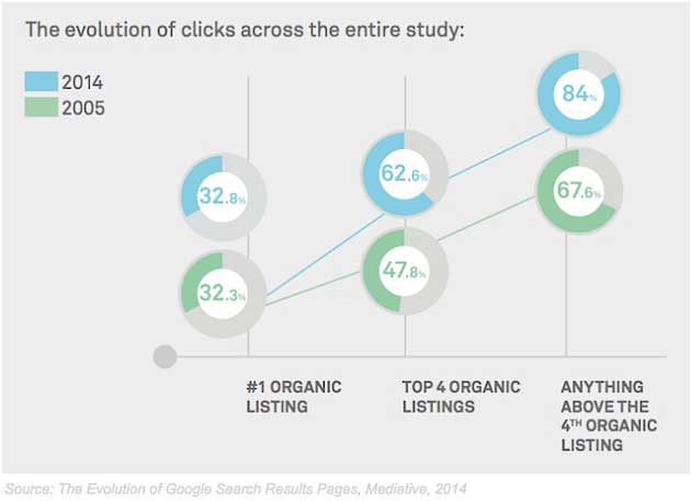
- The top organic result still captures about the same amount of click activity (32.8%) as it did in 2005. However, with the addition of new SERP elements, the top result is not viewed for as long, or by as many people.
- Organic results that are positioned in the 2nd through 4th slots now receive a significantly higher share of clicks than in 2005.

About the research: The report was based on data from an eye-tracking study of 53 participants who were asked to complete 43 common search tasks. All searches were conducted on desktop computers in Canada using the Google search engine.


