Buyers are becoming fussier. If you don't provide a delightful and error-free experience with your brand or website, you're likely losing out on conversions, leads, and clients.
One of the most critical elements of your landing pages and conversion paths is your form, which acts as the gateway between a user and you—either keeping the visitor a stranger to your company or helping turn that visitor into a lead for your company.
A form that feels like a chore to fill can kill the experience your landing page provides and, as a result, kill conversions.
Here, I'll share five conversion rate optimization (CRO) principles you may not have considered to increase lead volume and surpass your lead-generation targets.
1. Obsess over Google Analytics conversion paths
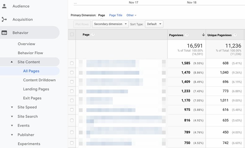
Google Analytics tells you everything you need to know about how users interact with your website. It's a goldmine for finding data that could help you improve your user's experience when they visit.
Start by looking at your conversion paths and asking these questions:
- Which landing pages are the most popular?
- Which pages are most likely to result in a purchase?
- Which pages cause most people to drop off?

Ask yourself: Why are these pages so popular? What makes them convert so well? You could sense-check by clicking through the pages manually, run a round of user testing, or ask customers for their feedback.
For example, you may find that you have pages that...
- Generate high amounts of traffic but have a low conversion rate
- Generate low amounts of traffic but have a high conversion rate
In the case of the former, put yourself in your visitor's shoes. Interact with the landing pages as if your user would. Do you come across any errors? Do you feel exhausted filling out so many fields? Those are emotions your users could be experiencing, so address them quickly.
You should also look at the source of that traffic. Segment your analytics by channel to see which channels are reporting a high bounce rate or high conversion rate. In the case of those with a high bounce rate, investigate why that might be so.
For example, you may be experiencing a high bounce rate from Facebook ads. Some marketers may want to cut spending there altogether, but it'd be wiser to look at your audience targeting.
It all comes back to putting yourself in your users' shoes.
2. Harness the power of image-select questions
B2B audiences are busy. They have rigid daily schedules and no time for nonsense. Which is why you must make your customer journey as easy for them as possible.
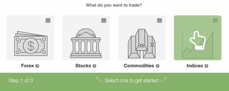
One way to do that is to use image-select questions—a format that reduces the number of clicks before submitting a response.
We first experimented with this format at BrokerNotes, ditching traditional dropdown forms in favor of image-select and reducing the number of required clicks from nine to three. At the time, the change increased our conversion rate from 11% to 47% (the current conversion rate is now 54%).

To make this format easier for marketers, we created a tool called Leadformly. It allows you to scrap unnecessary questions, use image-select in favor of text-only forms, and make it easier for your audience to take the required action.
3. Experiment with long-form copy
When analyzing your top-performing pages, read through the copy you've used. You may find that some of those pages include long-form copy, providing more comprehensive information than pages with a high drop-off rate.
That might be because senior decision makers, regardless of industry, need be armed with as much information as possible before making a decision. They must be equipped with a strong argument when handing over their details or making a buying decision. They can't make off-the-cuff decisions like a B2C audience might.
If you're looking for quick optimization techniques to try out, and you don't have enough real estate on your landing page, replicate Shopify's landing page strategy—in this case, linking to a free resource that shares additional information relevant to the offer:

You can even gate that content and collect your audience's email addresses to get them on your list. This way, you capture potential leads who are earlier in the buying cycle, down-selling the conversion so that you might nurture them over time.
When writing your sales and landing pages, consider using making information easily accessible, as Shopify's has done. Give your audience all the information they need to make an informed decision, and don't be shy when explaining key points.
4. Focus on persona-driven motivation
Consider the motivations of your audience for filling out in an online form—whether that's to inquire about a service or access a free e-book. Chances are, it's not to have a chat with you or gain some reading material for their commute home.
Rather, they have a problem that you can help with. Use that motivation behind why someone is submitting a response to your online form instead of focusing on the action itself.
For example, if you've got an e-book on how to create a content marketing strategy, those downloading it aren't doing so for bedtime reading. They're downloading it because they want to impress their boss by generating more revenue and otherwise improving via their content strategy.
This concept should form the basis of your form's copywriting, especially the call to action. Using the example above, a motivation-based CTA, such as "learn to master your content now," would be much more effective than the utterly unimaginative "download e-book."
Here's an example call to action from Foundr's Instagram masterclass:

Your audience is more likely to convert with outcome-oriented calls to action than generic copy such as "submit" or "join."
5. Use data to auto-fill form questions
The popularity of AI and Big Data tools is increasing. But you shouldn't fear that robots are coming for your job. You can use AI to your advantage: By using data you've already collected on people, you can reduce the amount of time they need to become leads.
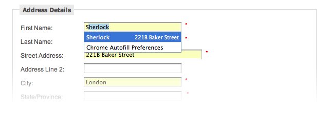
If you're skeptical about introducing AI as part of your strategy, you should at least be providing your customers with a streamlined experience using basic automation principles. For example, if your site's cookies show that a site visitor is based in Kansas, use smart forms to automatically fill in the "State" field rather than asking them to fill it in themselves:

Source: Google Webmaster Central Blog
You could also allow Google Chrome's stored data to fill in fields such as...
- First name
- Email address
- Contact number
- Bank details
The goal here is to make it as easy as possible for your audience to go from site visitor to qualified lead. Don't make visitors work harder than they need to, especially if you have the tools available to help them.
* * *
Now that you're well equipped with the CRO principles that have the power to skyrocket the number of leads you're getting through your website, it's time to put it into practice.
CRO is not a one-and-done practice. Your buyers' preferences are always changing. Building feedback into your processes can help you find and fix user experience problems before they become an issue.


