You hold the World Wide Web in the palm of your hand.
Yes, smartphones are the predominant way people access the Web. But, no, they don't rule e-commerce in the same way. When it's time to convert browsers into buyers, the dominance of the smartphone withers.
Why is that?
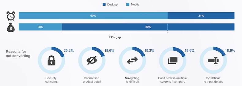
Mobile's Hierarchy of Needs, a report from comScore, points to a whopping 49% gap between share of minutes on mobile versus share of e-commerce spend. It also cites the top five factors that minimize conversion:
- Security concerns
- Cannot see product detail
- Navigating is difficult
- Can't browse multiple screens/compare
- Too difficult to input details
Mobile site designers should also consider the user's mindset. "When users visit a mobile site, they tend to be in more of a rush and have a clear goal in mind. Keep users' goals in mind, and make sure key information (such as business hours and address details) are clearly visible," a blog post from Duda, an online platform that digital agencies use to provide their clients high-converting mobile sites, reminds mobile designers.
Clearly, mobile websites must now be designed to give shoppers the experience they want.
Let's look at seven things you can do to increase conversions in mobile commerce.
1. Elevate trust
Security concerns topped the list of the five factors that most threaten mobile conversion, so we'll begin with some ways to increase the buyer's confidence and trust.
Include trust marks. As the name implies, a trust mark is a symbol designed to indicate your information will be transmitted and stored safely.

Use SSL or similar cryptographic protocol, which will display a lock sign in the address bar indicating your website employs advanced encryption.
Consider trust marks such as those from Norton Security and other security software to assure customers your website is protected.
Also consider a partnership with highly trusted brands, so you can include an option such as "Login with Amazon," or a PayPal option.
2. Design effective buttons
When designing a call to action button, you must consider its placement, color, and other design elements that will make it both easy to find and attractive.
Smashing Magazine gives an interesting lesson on the good, OK, and bad zones on mobile devices for those who use their thumbs or for "cradlers," who click with their pointer finger:
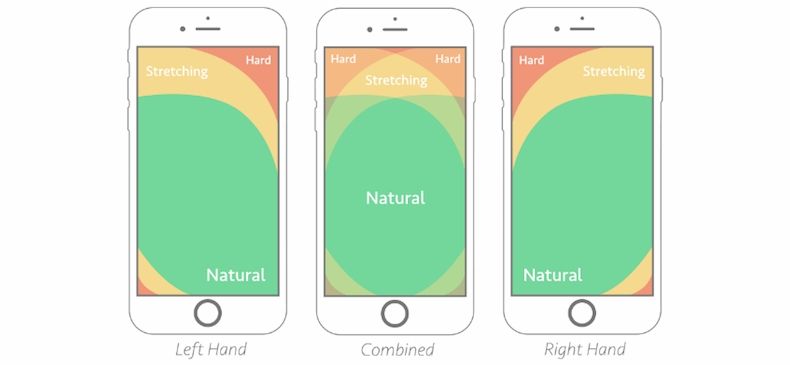
On mobile, you must also consider button size. Ensure the button is wide enough so shoppers can easily click on it without having to change their hand position. Don't make would-be buyers work hard to take the final purchase step.
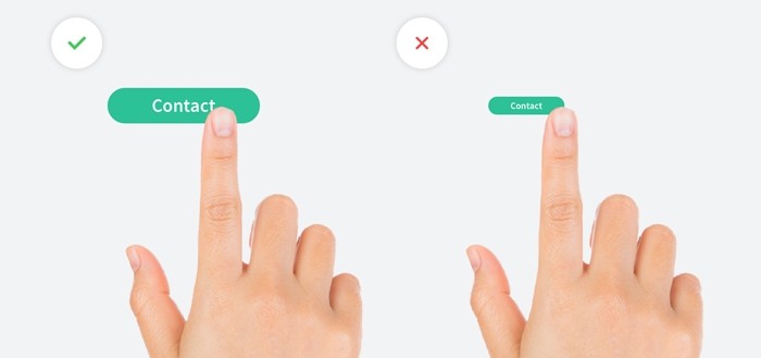
Image source: Duda
3. Design friendly forms
The checkout form is all-important to making the sale. Sadly, fields that are difficult to engage with and are error-prone threaten its success.
Build your forms more effectively with...
- Essential fields only
- Full-width fields
- Clearly labeled fields
- Large, legible fonts
- Marks to indicate required fields
- Immediate response to input errors
- A call to action immediately below the form
4. Accelerate the checkout
No one likes inputting their information when they return to an e-commerce site, but it's particularly annoying on a smartphone. Ease the log-in and checkout processes for mobile users by allowing...
- One-click sign in from a trusted source
- Autocomplete options
- Guest checkout
- One-click checkout
- A checkbox that copies the billing address to the shipping fields
- The keyboard to auto-adjust from characters to numbers and symbols
- Payment via a trusted payment provider, such as PayPal, Google Wallet, and Stripe
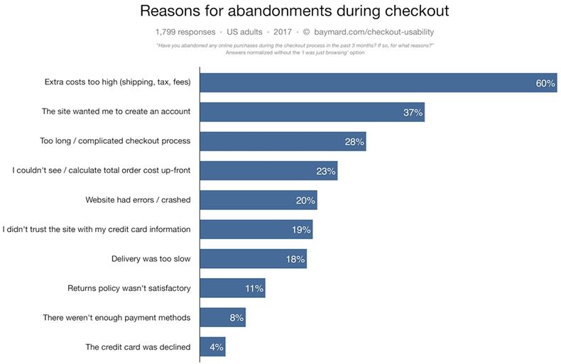
A Baymard study found that a complicated check out process is the third-highest cause of cart abandonment:
5. Maximize speed
Slow shopping and checkout experiences are serious conversion killers, so maximize the speed of the mobile checkout process.
- Present only what's essential.
- Refrain from upselling, cross-selling, promoting social media shares, or anything extra and potentially distracting.
- Nix all unnecessary images.
- Avoid stylized fonts or fancy design of any kind.
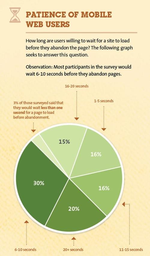
Image source: Kissmetrics
6. Make editing easy
You do not want to invite or steer visitors away from the checkout process.
Still, some e-commerce checkout processes invite buyers to edit the choices they've made: colors, sizes, quantity, shipping options, etc. That's OK, but it's dangerous to send them backtracking.
Instead, make order editing easy. Thinks about introducing "edit" buttons beside each item that invoke a simple lightbox to the product variations. The idea is to give shoppers the ability to change their choices and save their changes without having to leave the checkout page.
7. Add a click-to-call feature
Perhaps your mobile website aims to produce business in ways beyond the online checkout process.
Duda suggests putting a click-to-call option that allows users to tap a button to place a phone call to your business. It's an obvious strategy that local retailers of every kind should advantage of.

Make the 'e' in e-commerce mean 'easy'
In a mobile-first world, e-commerce companies need to carefully evaluate each and every part of the customer experience and identify any potential factors that might deter a shopper from leaving happy.
Put your mobile shopping site to the test by re-examining the seven elements I've presented here, and make it easy for customers to buy from you.


