In PPC advertising, landing pages are crucial to performance. But it's not just any landing page that will work for your industry or company. You can read all the advice you want and apply all the supposed best-practices that experts tout, but sometimes those practices do the opposite of what you want.
They hurt your PPC conversion rates.
So with all the PPC landing page tips out there, how do you prioritize your A/B testing to achieve the best results, as quickly as possible?
Let's dive in some uncommon ways to do that.
PPC Landing Page Tip No. 1: Add more fields and steps
Sounds super-counterintuitive right?
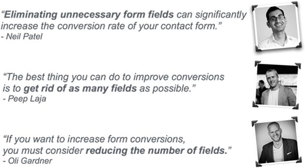
The common landing page best-practices tell you that removing fields improves conversion rates, and the experts say it, too:
It makes sense. Until it doesn't...
And although Neil, Peep, and Oli are correct in principle, it's an approach that in reality can be detrimental to landing pages.
Because if you keep removing form fields, then you're left with the name, email, and phone number fields.
And guess which fields are the most threatening for a visitor to fill out? Those three!
If your visitors can get their questions answered without having to give their personal contact info, then I bet the vast majority of them would take that route.
Don't believe me? Here's some proof.
Advanced Grass, an artificial grass installer, had been sending PPC traffic to its website—instead of a landing page—for quite some time.
To test an alternative approach, a one-step landing page that isolated the PPC visitor was created, and performance improved... but not as much the company hoped. Next, a two-step form was instead created—with additional fields added to the conversion process.
Here's what the first step of the two-step form looked like:
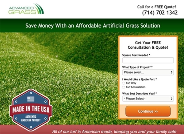
Notice how no personal information was asked
And here's what the second step looked like:
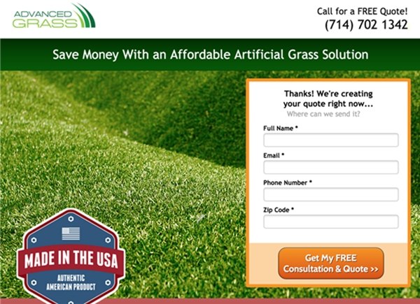
Notice how the form headline gives a reason to ask for personal info
Here are the results:
- 214% increase in conversion rates
- Increase in lead quality as a result of the additional fields
So why did this happen?
- When visitors get the (first) impression that personal info (name, email, phone) is required, then they know they won't get an answer to their questions right then and there; they're most likely nervous about a salesperson calling them.
- The questions you ask on the landing page steps leading to the last step don't have to be in direct relation to your offer. You can make up questions and ask about the visitor's ZIP code or number of employees, for example. This will get them to take the first step.
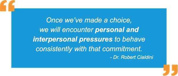
- With multi-step landing pages, you get people to start a commitment they don't want to bail on. This approach comes straight from Dr. Robert Cialdini, the author of Influence, The Psychology of Persuasion.
That's just one example. No matter what your landing page goals are, the strategy of adding more steps and more fields can work tremendously. (If you'd like more examples, check out the post I wrote on multi-step landing pages.)
PPC Landing Page Tip No. 2: Drop the small talk
If you're like many PPC advertisers who use landing pages for lead generation, then you know that value of getting in touch with a new prospect as fast as possible.
Because leads lose tremendous value after just five minutes from when the conversion happens:
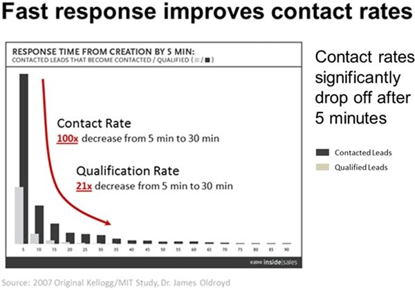
Those are some super-depressing numbers
See, a lot of companies use live chat to generate leads, but most of them are horrible at it:
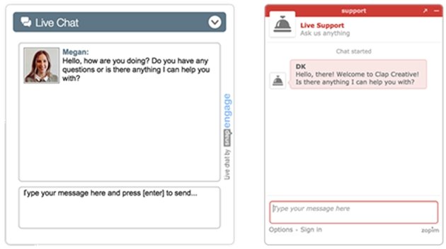
You just did the exact same thing retail employees do who suck at sales
So instead, why not try to start the relationship on the PPC landing page instead of after it?
I call this tip the "Get to the Point and Don't F' Around" hack.
If your goal is to make the sale offline after someone fills out the form, then start the conversion using clever chat greeters.
If you use the traditional and polite chat greeters, then the best thing you'll get is people clicking the little "x" in the chat window. No one cares. Instead, ask questions that are super easy and quick for people to answer and have the dialog box pop up after your visitor has been on your landing page for a certain amount of time (say, 30 seconds).
A case study from Olark provides an example from a promotional company using chat greeters to start the lead gen process before a PPC visitor has finished filling out the form.
Here were the three chat greeters that were split-tested:
- "How many lanyards are you looking for?"
- "Hi! I'm Brad! Let me know if you need any help!"
- "What event do you need the lanyards for?"
Guess which chat greeter won by the largest margin?
"How many lanyards are you looking for?" helped increase conversion rates 37%.
Usually, questions with numeric answers have the highest response rates because they don't require much thinking from the visitor. It's a quick answer.
PPC Landing Page Tip No. 3: Don't spread yourself too thin
If you're obsessed with PPC granularity like I am, then you know that spreading yourself too thin can also hurt you.
Just as the law of diminishing returns states that the more you improve something, the faster you'll get lower output, so too in the case of your PPC landing pages.
Many people are obsessed with message match, and rightfully so. The downside of message match occurs when you create too many individual PPC landing pages that match your various keywords: Your conversion data becomes diluted across too many pages, and statistical significance takes longer to achieve.
If only there were a way to still have message match happen while keeping everything on the same landing page so you could split-test faster...
Lucky for you, there isn't just one way; there are three.
One of the fastest ways to manipulate the text on your landing page via URL parameter strings is to use Unbounce's dynamic text replacement feature. You can read a case study on how one agency significantly improved efficiency while getting faster results.
Another impressive solution is Marketizator's dynamic text tool, which can read multiple variables to give a much more personalized landing page experience to each unique PPC visitor.
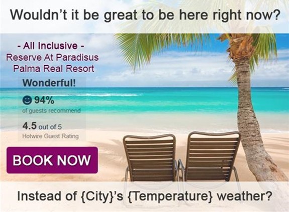
Automatically bring in your visitors' city and current temperature? Woah...
Last but not least is dynamically changing fonts to match your image ads (if you're that crazy to test the power of fonts and the impact it has on conversion rates. Which actually isn't that crazy at all).
Using both PHP and CSS, Google has a specific code asset that allows you to connect different font libraries that you can take advantage of to attempt improving your conversion rates.
Just remember to track the conversion rates individually and the font and style level and not as one common aspect.
Oh, and one more thing.
You can continue to grow your conversion rates by using area-code specific phone numbers along with ad copy and landing pages that match the exact city the visitor is in. Check slide 76 and 77 from this SlideShare for more information and the results you can expect.
Here's what you should do next
You have the PPC traffic and now you have the ideas to get more PPC conversions.
These PPC landing page tips mean nothing if they're not implemented and tested. And lucky for you, they're super-easy to set up.
What other uncommon landing page tips have you found to work well? Let me know with a quick comment below!


