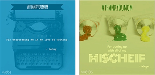
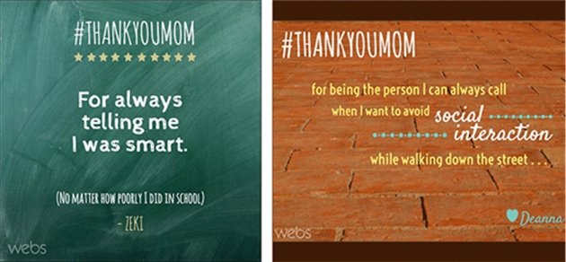
By now, social media has become second nature to many of us. Tweeting, posting, and updating comes as naturally as breathing, and we've come to understand—through trial and error—what works and what doesn't.
For social engagement, especially in the case of businesses, it's no secret that visual posts receive more user attention and better feedback than blocks of text.
In fact, a 2014 study we conducted at Pagemodo of nearly 5,000 user profiles showed that posts with photos received the most retweets on Twitter and likes on Facebook.
But with a secret that big out in the open, it's becoming more difficult for marketers and social media managers to cut through the visual clutter and get noticed in a sea of social images.
That leaves us asking, What can social media professionals and marketers do to set their images apart from the rest?
Here are a few design tips that every social guru should keep handy.
Make it colorful

That doesn't necessarily mean a full-on rainbow, but adding a splash of color to a user's News Feed could mean the difference between scrolling past and stopping on your image. Consider using a transparent overlay—adding a color atop an image and turning the opacity down—for a professionally layered look that combines color with imagery.
Reinforce the message with icons
![]()
Whatever you're trying to promote, whether hand-scooped ice cream or a beachfront rental home, chances are there is an icon or image that represents your business, product, or service. Popping an icon into your graphic helps to emphasize the message; it can also add poignancy or humor that your followers might relate to.
Play with typography

Creating standout visuals can be as easy as experimenting with fonts. Start off simple by mixing plain sans-serif fonts with more decorative scripts (our social photo editor offers a variety of typefaces you can use). More creative types can try something a little more advanced. For example, manipulating typography so that all lines of text form a square shape is becoming an increasingly popular trend in the graphic design world.
Use the background

When creating a visual for social posting, most people tend to focus on the design of the text and imagery alone. However, the background can sometimes be just as useful as what is at the forefront of the graphic. Using a background that reinforces your message, whether literal—like a post about a pizza sale written on a backdrop of cheese and pepperoni—or something more abstract, can work to your advantage. That can also mean using the negative space to draw people in to the message. A short message or simple icon against a solid background color can often be more than enough to get the idea across.
All eyes on the hashtag

Any true social media aficionado, especially one that uses social for business, knows the importance of making both content and images shareable—and hashtags make that possible. That said, it's important for hashtags to be a focal point on any social graphic you produce. Whether it's highlighted in a different color, within a shape, or surrounded by a creative border, it's important to highlight the hashtag—make it front and center—so users can converse about your brand and you can effectively engage with them.
Let your personality shine

As with anything on social media, the more personal, the better. Did you totally geek out over the latest Apple product release? Tweet about it! The same rule should apply to all of the images you create and share via social. Don't be afraid to put some personality behind it. Puns, humor, even a nod here and there to a niche topic not only gives your audience a sense of the character behind the screen but also helps your followers relate to your brand, product, or service on a more personal level.
* * *
Posting images alone is no longer going to cut it if everyone else is doing it. Becoming familiar with basic design tricks and keeping these in your back pocket can give you the creative edge you need to capture your followers' attention, get your content shared, and, most important, engage your audience.
- To grab followers' attention and engage your audience on social platforms, well-designed social images are a must; otherwise, your brand may be easily overlooked.
- When creating a well-designed social image, experiment with colors and fonts, emphasize the hashtag and message with icons, use the negative space, and—most important—let your brand's personality shine.


