Your website can be great channel for customer conversion and online sales.
Among the various pages included in your navigation menu (e.g., Features, Tour, About, Contact), you might also include a dedicated pricing page where you describe—and list the prices of—your services or products.
That's a typical approach, especially if you offer some kind of online service or software, such as an email platform, online courses, various advertising packages, or a typical software-as-a-service subscription plan.
The pricing page is not a magic bullet for making sales, however; your website as a whole needs optimized copy and smooth flow so that you can present your products' value and overcome potential objections.
An important part of an optimized website is your pricing page. So how can you best structure it? How can you present the information in the most effective way to help your site visitors decide to start using your product or service?
Here are seven conversion marketing and pricing tips for designing your pricing page.
1. Start with the headline
Every landing page, from your homepage to your Product Tour and Contact Us pages, should have different headlines appropriate for their purpose and their unique call to action. A webpage headline shouldn't just remind the visitors what page they're on. Headers aren't there just for navigation purposes. They need to reflect visitor expectations and grab their attention from the very start.
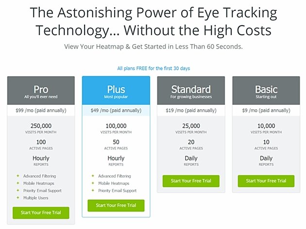
So the rule for the pricing page is to avoid simple headlines (e.g., "Pricing," "Plans & Pricing," and "Our Prices"). Instead, make them more engaging, like the one used at CrazyEgg; note the clear statement of CrazyEgg's value proposition.
2. Create only a few pricing plans
Psychologist Alan D. Baddely, involved in designing the United Kingdom postal codes, noticed in his studies that people tend to remember information in groups of 3 or 4 for approximately 20 seconds. It's no coincidence that phone numbers tend to be divided in 3-4 groups of digits; that way, our brains can easily scan and memorize them.
When structuring your pricing, present your offer into a group of 2-4 choices. Narrowing the number of choices reduces shopper anxiety, as noted by psychologist Barry Schwartz in his book The Paradox of Choice. You want your website visitors to lower their shields so you can persuade them to choose one of the offered products.
Lesson: don't clog the pricing page with too many choices; instead, display just a few options.
3. Don't give only one price choice
I suggested earlier that you display your products/services in groups of 2-4. If you wonder why the minimum is two and not one, here's an explanation: To reach decisions, people tend to make comparisons among several choices. If you show only one option to your visitors, they'll have trouble deciding whether it is a good choice.
Giving only one choice can actually lower the conversion rate, tests have found. That's why the recommended minimum is placing two products side by side; that way, visitors can easily compare the two products to determine which one is more suitable for them.
That approach is based on the concept of price anchoring and should play and important role in structuring your pricing strategy.
4. Highlight your preferred product
To help your visitors make a choice, highlight one of your product/price choices to make it stand out. Make sure the product is neither too expensive nor too cheap, and clearly state that it is the best value for the money (and be prepared to back up that assertion).
Another type of product you can highlight is your most popular product. When you feature your best-selling product, you can harness people's herd mentality and lead them to select that particular product.
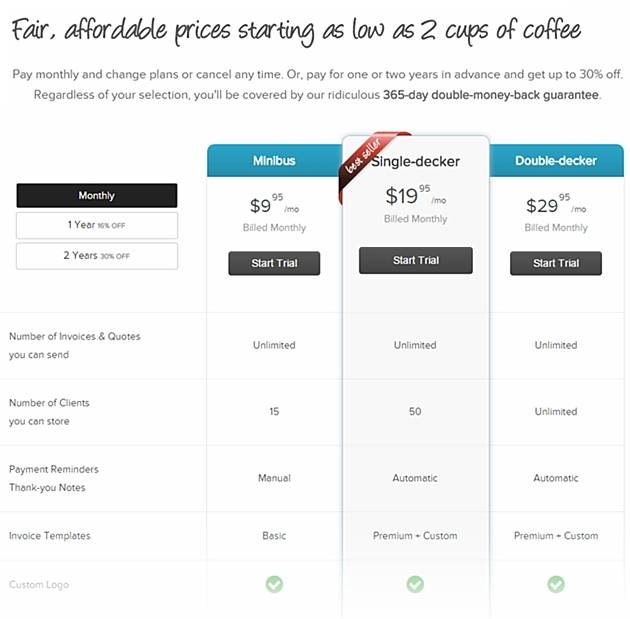
Here's an example of our pricing page at Invoicebus, (I'm a co-founder). Notice the Single-decker plan, which is highlighted as the most popular one:
5. Display a matrix of features
The best way to display the features and options for your products or services is with a table layout. That way you can clearly show a comparison matrix of your products— their differences and similarities. Usually, the columns list the various products/prices, and each row displays the features for that product or service.
Certainly, you can structure the display of product features in other ways, but doing so may strip away the intuitiveness of a table format and make the purchasing process more difficult, leading to fewer conversions.
Comparison tables can help your visitors easily scan information and compare your offers.
6. Offer incentives
You should definitely be trying to hook prospective buyers with the inherent value of the products or services you sell by making crystal clear what they'll be getting.
Yet, even with all that product data you've provided, some people will remain on the fence. They need a little more motivation to make a switch from your competitor and jump to your side of the fence.
One way to overcome visitor objections is by giving them incentives, bonuses, and guarantees:
- You can offer bonuses related to your product if they refer a friend—e.g., increased email send limits if you're selling an email newsletter platform, or bonus storage if you're offering cloud backup service.
- Or you can discount prices in return for a longer commitment—if they're willing to pay you up front for one or two years, for example.
- Often, companies offer a money-back guarantee, which helps make potential customers feel more comfortable when making a decision. People can get emotional when spending their hard-earned cash, so giving them a guarantee reduces fear of making a decision.
7. Use testimonials and FAQs
Another way to optimize your pricing page for conversion is with testimonials and a frequently asked questions (FAQ) section.
People value the opinions of a third party not directly related to you. Testimonials constitute evidence in support of a purchase and bring potential customers closer to a buying decision. So, on your pricing page, include customer pictures and quotes from customers.
Displaying FAQs on the pricing page is a best-practice for ensuring a high conversion rate. The FAQs should contain information about payments, cancellation and refund policies, shipping, etc.
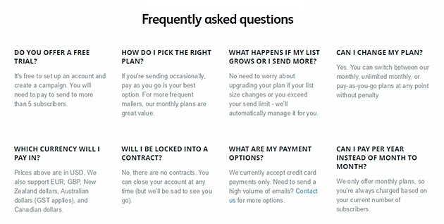
Here's the FAQ section of the Campaign Monitor pricing page. Notice the short and clear answers for major questions related to the service:
Note: All screenshots are as of April 2015; current versions of pricing pages may look different from the ones displayed here.