You've spent time and money designing the perfect marketing campaign. You've designed a flawless strategy to drive customers to your awesome sales page and you know it will convert. You've thought of everything...
Except your shopping cart process.
When you design a marketing campaign, you're focused on selling a solution or understanding the motivation for buying a product. You're thinking about what makes someone click on the "buy" button. But until the last "confirm order" is clicked, the sale is in jeopardy.
Shopping cart abandonment can be as high as 75%! At any point in the checkout process, customers might get turned off; they'll then simply click away from the site.
In short, your checkout process is just as important as your marketing strategy.
Here are three of the biggest shopping cart turnoffs that can kill your e-commerce sales—and some easy solutions to keep customers engaged throughout the checkout process.
Mistake No. 1: You make every customer register before buying
The reason for making customers register before they buy is clear: You want their email address so you can send them promotional emails. Consumers are smart and understand your intent. They already see hundreds of ads and emails each day, and they don't want to see any more. Demanding a registration creates a hurdle and causes resentment and frustration. It's just bad form.
Payment platform PayPal, advises (PDF) that companies avoid asking for pre-registrations. (Of course, you can ask customers after the sale whether they want to sign up to receive your newsletter or special offers.)
Although you want to build your email list, you don't want to sacrifice a definite sale for the possibility of a sale in the future.
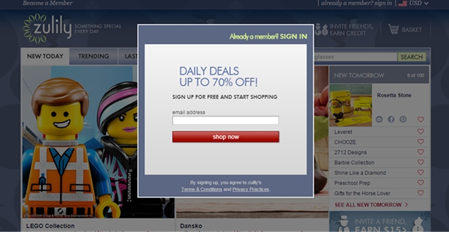
Zulily requires customers to be "member" before they can even browse its website. Here's how one consumer reacted on Facebook: "If you force me to sign up on your page just to view your products then you lose a customer before you ever had a chance to get one."

Mistake No. 2: You've overlooked m-commerce
Mobile commerce is expected to reach $626 billion by 2018.
You might assume that such a growing market would be sufficient incentive for all online retailers to build great mobile websites. Yet, 41% of buyers don't complete a purchase on mobile device because credit card information is too difficult to enter, and 47% give up because the checkout process takes too long source (source: Harris Interactive, 2014).
A great mobile website is essential to capturing a piece of this growing market. Every e-commerce website must run flawlessly on any mobile device.
Ensure your site and checkout adapt to different screen sizes. A few forward-thinking e-commerce platforms are actually "mobile first" (the platform was designed for mobile users first, website users second).
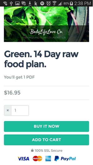
Selz is a great example of a mobile-first e-commerce platform, which Jessica Sepel uses to sell her "Green. 14 Day raw food plan":

If the sales process on a mobile device is slow, long, or confusing, the consumer will quickly lose focus. M-commerce is forecast to account for 22% of e-commerce sales in 2015, so don't wait to give consumers what they want. Make it easy for them to shop from any device they choose.
Mistake No. 3: You surprise customers with high shipping costs
Every online customer wants to hear the phrase Free Shipping! They don't want to be surprised just before they click "confirm order" with a shipping price they weren't expecting. In fact, 34% of online customers abandon their shopping carts because of shipping costs shown late in checkout process.
If you don't offer free shipping, you should state your shipping rates or policy early in the sales process. If you have a flat shipping rate regardless of order size, use that to your advantage during the process. If you offer free shipping on orders of a certain size, clearly state that as well. For example, let's say you offer free shipping for any order over $100; consumers will often be happier to add a few more items to reach the $100 mark than to pay for shipping.
The general guideline is to design a shipping policy that won't make consumers cringe when they see it. Design a policy that you can also use in your marketing strategy, not one that you want to hide until the end of the sale and hope the consumer doesn't notice.
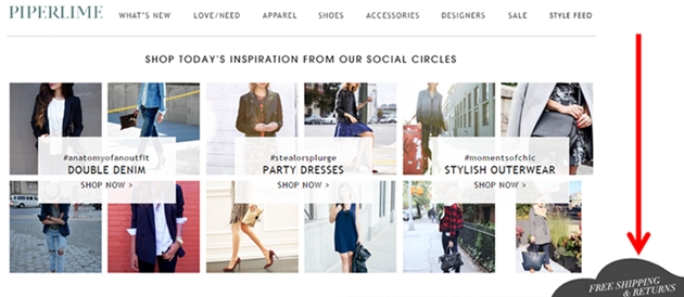
Piperlime, for example, clearly displays its free shipping policy on its homepage:

Your shopping cart process is part of your marketing strategy
You've spent time and money designing the perfect marketing campaign. But if you overlook the shopping cart process, you could be losing sales. Remember, you don't have a sale until the "confirm order" button is clicked. So don't give consumers any reason to give up on the sale.
You need a great product, plus a simple checkout process. Go through your sales process from the consumer's viewpoint. You test headlines and sales copy, so why shouldn't you test the checkout process as well?


