The planning. The design. The writing. The programming and testing. Building a website can take hundreds of hours of work over months of time. And then, finally, it's live.
The result of all that effort depends on a lot of little things. And some of those little things can often hurt the result—big time.
Some common mistakes have big consequences, but they're also fixable. And some of those fixes are easy. This article is about five mistakes that can cause big problems but have easy fixes.
Note: The screenshots in this article are from sites that make big mistakes, but to protect their identities we've obscured their logos.
Mistake 1: Homepage Headline Hints
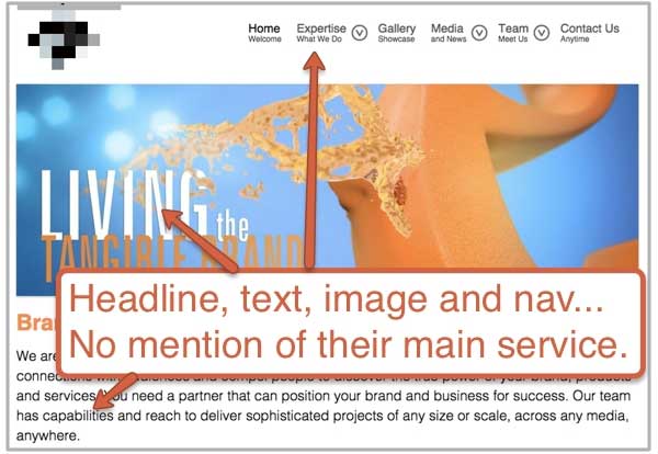
It's not obvious enough. Your homepage hints at it, but it doesn't explicitly tell visitors what you actually do. This is a devastating mistake that combines several design and content flaws.
- Your homepage headline is clever but unclear.
- Your featured image (or slideshow) doesn't show your product or service.
- Your navigation labels are generic: Home, About, Services, Contact.
- Your homepage text is all branding and benefits but doesn't actually say what you do.
Not all your visitors know you, so a homepage that doesn't immediately communicate what you do is a big problem.
The Fix: Stand back from the screen and squint your eyes. What part of the homepage stands out the most? Now pretend you don't know this company. Is it obvious what the company does?
Make sure the headline names the main product or service. Make it your value proposition. Make the main visual meaningful. Make the navigation labels descriptive, following navigation best-practices.
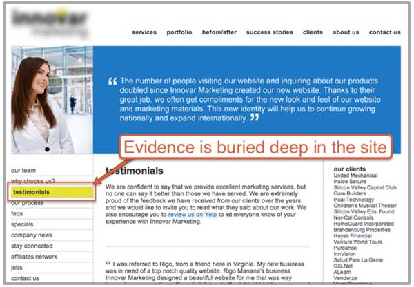
Mistake 2: The Buried Testimonials Page
People love you and they've put it in writing, but rather than put that social proof onto your product or service pages, you've tucked them all away on a separate page.
Take one look at your Analytics, and you'll see that only a minority of your visitors are visiting that page. Although those quotes strengthen your message, you've weakened them by separating them from the rest of the site—far away from the marketing claims they're supposed to support.
The Fix: Get rid of your testimonials page. Instead, put your testimonials (and any other social proof you can find) throughout the site:
- Make the testimonial match the page it's on, especially if it includes a relevant key phrase.
- Put a few of your best endorsements on the homepage.
Mistake 3: Social Icon Leakage
It's a nice clean site with a modern design, simple navigation... and big, colorful candy-like social media icons at the top right.
Those buttons pull your visitors' attention away from the content. Worse yet, they pull your visitors off your website and onto other sites that are full of distractions.
Do you really want your visitors to click that icon? If they do, will they ever come back? Isn't a visitor Facebook or Pinterest farther away from your brand? Less likely to become a lead or customer?
Those social media icons are leaks in your lead generation funnel. It's good when visitors come from social networks, but bad when visitors leave and go to those social networks.
![]()
The Fix: Remove any social media icons that stand out. They shouldn't be colorful or at the top of the page. Put them in the footer, and, if possible, don't show the colorful version of the icons until the visitor mouses over them.
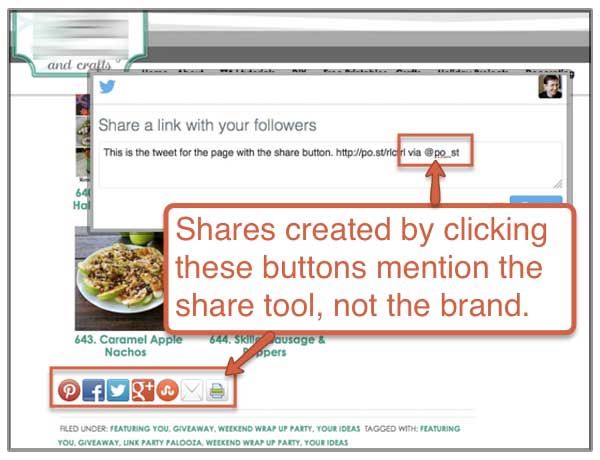
Mistake 4: Selfish Sharing Buttons
You wrote it hoping people will share it. You want people to click those share buttons to make you more visible... but you're using share buttons that mention another brand.
The little share buttons on blog posts are usually created by plug-ins, and unless they are customized they're often set the mention the company that built the plug-in rather than your brand. Notice the "via..." on the tweet created by this button:
The Fix: To make sure that your share buttons are promoting your brand and not the company that developed the plugin, either choose a plugin that doesn't steal the credit or add a little code that takes back the credit.
Example: The ShareThis widget adds "via @sharethis" to every tweet created by its share buttons. So add a tiny bit of code to the button: st_via="YourOwnAccount" which puts "via @YourOwnAccount" at the end of each tweet instead.
If you need help, just send these instructions to your developer and they'll take care of it for you.
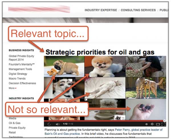
Mistake 5: YouTube Suggest-a-Lot
You produced a video, uploaded it to YouTube, then put it on your site. Great job. But once a viewer finishes watching, YouTube suggests a few others... that are not relevant to your brand.
It's possible that people are on your site right now, watching irrelevant videos. They watched the video about oil and gas exploration, and now they're watching puppies. Worse yet, they may be on your site—but watching videos that promote your competitors.
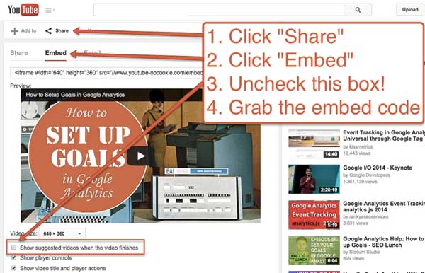
The Fix: When you embed a video from YouTube, turn off those suggested videos by following these steps:
- On the video page on YouTube, click "Share."
- Click "Embed."
- Uncheck the "Show suggested videos when the video finished" box.
- Copy and paste the <iframe> embed code into your webpage.
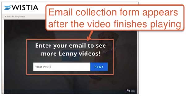
Better yet, don't use YouTube at all. Use a paid video hosting service. There are a lot of benefits to spending a bit of money on a pro service:
- You can customize the video player to match the colors of your brand.
- You'll avoid the "YouTube" logo in the bottom right corner, which would send your visitors away forever.
- You can easily add a call-to-action. Tools, such as those at Wistia, let you add an email signup form right on top the video; this feature is integrated with email marketing tools so the visitor is automatically added to your list.
* * *
Hopefully, you're making none of the above mistakes. But if you are, hopefully you can get to the fixes today.