Collecting contact details from website visitors is crucial for any business. When your visitors give you their contact details, it's the first yes on a "yes ladder" to eventually becoming your paying customers.
Here are examples of 10 proven tactics to increase newsletter subscriptions.
1. Header Bar
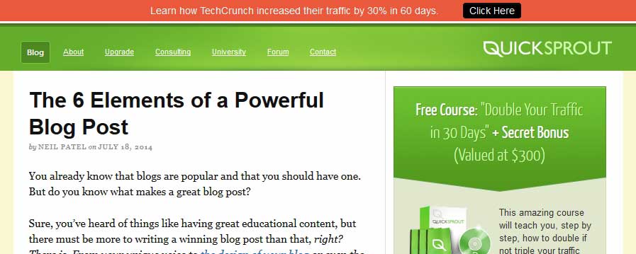
This section is prominent, and it can be made to float down with navigation so it's always there. Adding a countdown to create sense of urgency and combining it with a good value proposition can serve as subscription booster. To add such a toolbar to your website use HelloBar, ManyContacts, or similar solutions.
Here's a great example from Quicksprout:
Why does it work?
- The color of the toolbar differs from the overall design's color palette, so it is noticeable.
- Its value proposition is to share free knowledge about how a well-known brand (TechCrunch) has increased its traffic—and visitors would like know about the tactics that industry leaders use.
2. Pop-Up Notice When Users Go to Close the Website Window
The idea behind this is to track users' behavior (mouse flows) and display a notice at the very moment when they're trying to leave the site. It's powerful because visitors don't expect it. The element of surprise gives you a chance to pull out your big guns and offer something new and fresh that can grab visitors' attention one last time. Use services such as BounceExchange, Picreel, or Marketizator to add it to your website.
Here's a nicely done notice from Neil Patel:
- Neil's picture provides credibility and personality.
- It's interesting how Neil is trying to get personal with the user. Notice the emphasized "confidential" aspect of the value Neil's offering.
3. Top-Right Corner
The top right of a website is a prime spot for an email signup form. Visitors expect an option to be available here. Placing one there serves you well, especially with visitors who are already convinced that your offer is worthy the exchange. Additionally, placing it in the menu structure or right next to it makes it easily accessible and visible all the time.
Here are two examples from Social Triggers and LaunchRock. They are similar because of the placement, but different because of the approach they take:
- Social Triggers makes opt-in a part of the menu, redirecting to a separate landing page with copy that enhances subscription.
- LaunchRock makes the subscription stand-out a little more compared with the rest of the design, and offers subscription with just one click—the easy way.
- Both have based their value proposal on offering something for free, and they use "free" in the copy—one of the most powerful words for getting attention.
4. At the End of Every Post
If someone has read your post to the very end instead of just scanning around, that means he/she paid attention to the content and found it valuable—a perfect opportunity to ask them for their email address.
Here's an example from Visual Website Optimizer's blog:
- It's placed right underneath the content, so anyone who just finished reading can take the step and sign up.
- The value proposition is clear: convenient tips, in e-book form, straight to visitor's inbox.
5. On Your "About" Page
About pages are usually one of the most high-traffic pages. People want to know what your blog is about, who you are, and what they can learn from you. Why not give them the option of subscribing while they are reading about you?
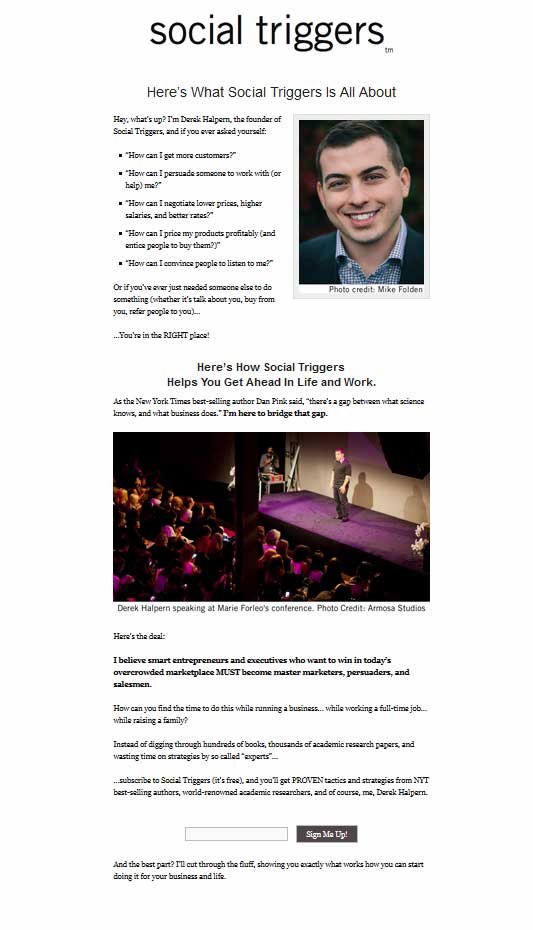
Derek Halpern, the face behind Social Triggers, does this very well:
- The About page is really long, so it has three opt-in forms, placed strategically within persuasive copy. (In the above image, you see only the first form.)
- Derek's face gives credibility to the website and builds trust, and he positions himself as an expert whose knowledge can help your business.
- The value proposition clearly indicates how subscribing is going to help you grow business.
6. Pop-Up Box for First-Time Visitors
Acknowledge a visitor's first time to your site. You can redirect them to content prepared especially for beginners and position yourself as an expert. Use a plugin such as Hybrid Connect and add a well-designed lightbox popup to your site.
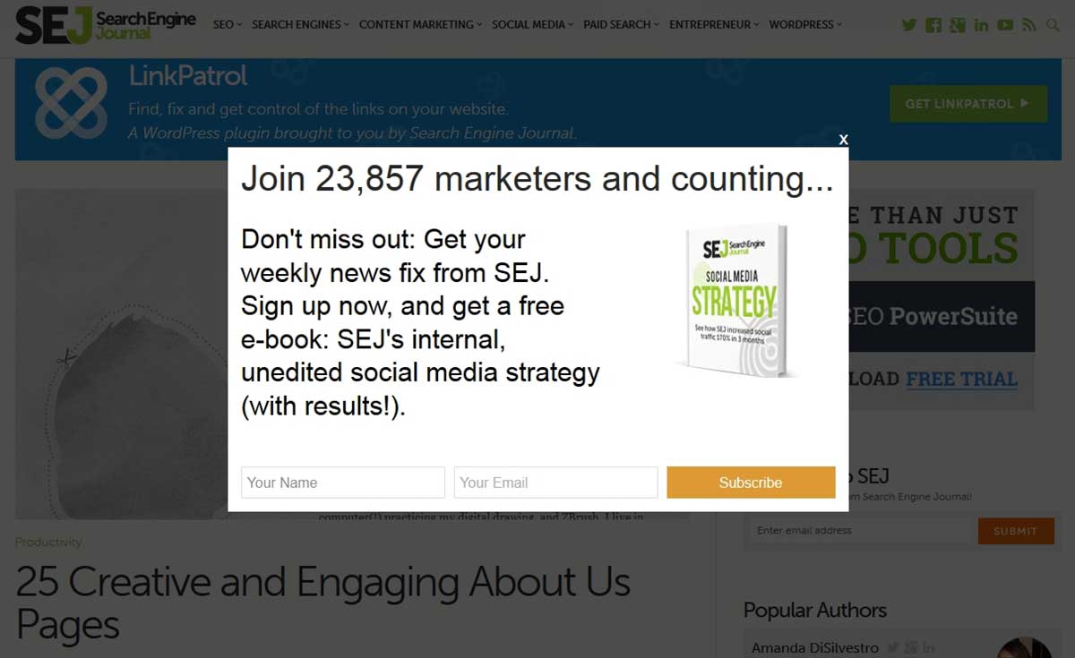
Here is a great example from Search Engine Journal:
- The numbers create credibility: There is a big community who finds SEJ helpful.
- The copy is playing on a combination of fear of loss ("Don't miss out!") as well as gain—stressing that the content is valuable because it works ("with results!").
- Consider how the e-book is presented: It looks like a real book. And you can get it for free!
7. The Footer of Your Website
A user who has scrolled down to your footer is normally an engaged visitor. So why not add a call to action here?
Here is good example from Zappos:
- It is placed adjacent to special-offers CTAs.
- The form is easily visible because of the contrasting colors.
- Copy says that the offer is shameless plug, which makes the message lighthearted, creating a positive impression and making the brand more human.
8. Sidebar
The top of a site's sidebar is definitely the most common spot that site owners will place their forms. It's prominent, catches the eye, and quite easy to implement on most websites.
Here are examples from KissMetrics and LeadPages:
- It's immediately visible.
- It plays on exclusivity/competitiveness: Be the first to get info.
- Instead of "subscribe" it uses "join us," suggesting community.
- It's in the same frame as webinar registrations, so the smiling faces of the experts hints at the expert community you're walking into.
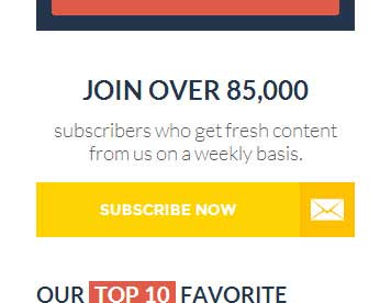
- Using a number provides social proof: 85K subscribers suggest that the content is of value for a wide range of people.
- "Fresh" suggests that you'll find new content to learn and benefit from.
- Notice how all it takes is the click of one button: The visitor isn't asked to fill in fields—a low commitment. After the initial interest, and the creation of momentum comes the pop-up notice and the user is asked for an email address.
9. Content-Aware Sliding Popups
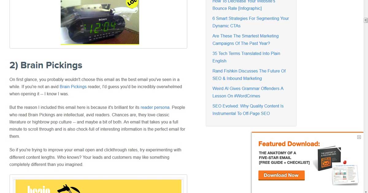
A sliding popups shows up only when a visitor has scrolled down to a particular part of the website. It offers content related to the content on the page being currently visited.
HubSpot's content-aware sliding popups are a good example of this strategy:
- The content in the popup differs from site to site, and it is relevant to what caught the visitor's attention; the freebies are relevant and most likely interesting for the visitor.
- It grabs attention because the user doesn't expect something to pop up in the margins of the page.
10. Splash Page
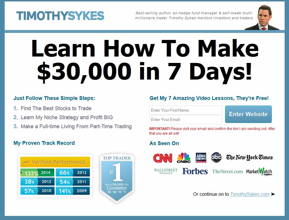
A splash-page is a variation of a landing page that shows up only to first-time visitors. It's similar to the popup that's shown upon first visit described above, but unlike it it's shown immediately, not after a certain amount of time on the site.
This splash page from Timothy Sykes is something that we can learn from:
- It speaks money. In big letters. All across the splash page.
- Trusted brands add credibility to Timothy's stocks advice.
- Numbers serve as verification of his knowledge.
- The opt-in form is easily visible, unlike the "continue to website" option at the bottom—so it gives the impression that you need to leave contact details to gain access.
One serious thing to consider before trying this last tactic: It works if you have a well-established reputation outside your blog; that is, people know you before they get to your website, and you have a lot of traffic. If those two conditions aren't met, you can lose traffic by using this tactic.
