Picture this: You're about to give the most important presentation of your life; if you convince the audience and gain their approval, you could change your business forever.
You take a deep breath and open your PowerPoint file. You've spend nights working on it. You've added tons of slides, and you've squeezed text onto each slide to make sure nothing's missed.
Yet, as soon as you start "reading" from the screen to the audience, their eyes glaze over. You keep going, pretending to be excited about your material. Oh Lord, they seem bored. Deep down, you know you've lost them already.
What gives?
I've sat through many a presentation by presenters who conveniently forgot that a tool (such as PowerPoint) is just a medium to re-enforce what they have to say. Instead, the speaker took a backseat and put the slides center-stage. A classic example of a presentation gone wrong.
Another common mistake is to read the slides word for word. Look, if you have to read them, you're too focused on your tool and not on your message. Congratulations, you're now a reader, not a presenter.
The problem here is you're making things that don't matter, matter. You, the presenter, are more important than your slides.
Let's now look at five rules for avoiding a really bad presentation.
1. Know your stuff
Needless to say, right? But how many times have you seen a presenter merely reading from a heap of material on their desk or, worse yet, their slides?
If you're passionate about the topic, you'll know it inside-out. Passion is contagious. It'll rub off on your audience.
Know your stuff so well that if your slides were damaged 10 seconds before you were to start, it wouldn't bother you.
Never distribute any material before you've finished. It's like bringing a kid to a candy store and asking them to behave. Not going to happen.
Provide printouts or a digital copy only after you've finished speaking. Create a summarized report for what you covered instead of sending a copy of your slides.
2. Show, don't just tell
You've probably heard it by now—humans are visual learners. About 40-65% of humans are visual learners, whereas 25-30% are auditory learners. Visual includes images, photos with text overlays, infographics, graphs, charts, videos, and presentations.
Let's say you're presenting to gain funding for a cause called Kill Traffic Pollution in China.
Which one's more effective: Throwing a bunch of bullet-point stats on a slide and explaining them what each means or showing them real-life photos of damaged lungs and asthma in kids as you elaborate with stats?
Yes, bullet points are good. But they cannot do much on their own. Clearly, the visual aid helps get your point across.
A picture can be worth more than a thousand words, so why not make an impact with a picture?

Source: Blah Blah Blah
Show and tell, don't just tell. Telling appeals to auditory learners only, where as showing and telling appeals to both visual and auditory learners.
But... don't use hideous built-in clipart! If you'd like to give a nice touch with rich visuals, try free web-based apps such as Visme for your presentations and other forms of engaging content.
3. Create a structure and flow
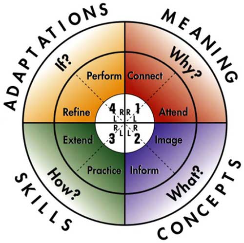
Without structure and flow in your presentation, all your good work is gone down the drain. A cool way to organize your work is to use the 4MAT system:

Source: About Learning
Using 4MAT, you divide your presentation into four parts: Why, What, How, and What if.
The "Why" defines the purpose. Why are you doing this, and why should they care? (Reminds me of Nietzsche, who said if you know your "why," you can live any "how".)
The "What" tells them what they are going to learn. (Remember that old saying—by Aristotle—about public speaking? "Tell them what you are going to tell them, tell them, then tell them what you told them.")
The "What" shouldn't take you long—just a few minutes, max.
Then comes the "How," which will take most of your time. You give them 4-5 steps of how to apply the topic in real life. In fact, each step will have a mini-4MAT of its own with all four parts.
Last, you tackle the "What if." This is where you take any questions and refine and summarize what you just told them.
4. Listen to Seth Godin
I swear by Seth Godin's rule of not more than six words per a slide.
That might sound extreme, but it works! I've seen slides with one word work like a charm because the presenter cared about and knew the topic first hand.
And here's what NOT to do:

Source: Washington University Libraries
Each of your slides is a transition into a new sub-topic that you'll elaborate for your audience. As you talk, you build rapport and a connection with them.
Avoid squeezing too many words on your slides because that will only confuse and turn off your audience. Instead, let your slides become the segue into an engaging explanation or a discussion about your topic.
5. Move
Really, no one likes to listen to you as you stand behind a podium. Get up if you're sitting for too long, sit down if you're walking, pace yourself when you're excited, and come out of your comfort zone every once in a while.
Own the space and use your stage fully. If you've done a good job of building rapport, you'll take your audience with you on a ride and into several positive states of learning.
6. Use the 10-20-30 Rule
You've got to love Guy Kawasaki for coming up with this rule, which basically states that if you are presenting for a business proposal...
- Don't go over 10 slides.
- Don't take more than 20 minutes.
- And don't use fonts smaller than 30 points in size (more reason to use fewer words on your slide).
Are you a presenter or a public speaker? How do you avoid a really bad presentation? Share your pro tips in the comments, below.


