Many famous brands use imagery to capture the essence of their products or service, even more so than their written content. For example, you've probably watched a television ad and figured out the brand behind the ad before you even saw a logo or any other identifying product.
Brands focus on quality images that evoke emotional responses, and use them consistently across multiple channels. One of those channels is social media, which provides brands an opportunity to use images to build brand loyalty and promote sharing.
Selecting the right images for social media requires some serious thought. Brands that skimp on the quality of their images risk lowering their brand's appeal.
Avoid bad editing and blurry photos
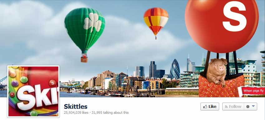
Consider the Facebook page of Skittles candy. It features a picture of a pig riding in a hot air balloon, with a city background. Although the imagery does reflect the eccentric Skittles branding campaigns, it is poorly executed. The pig in the image has been Photoshopped into the picture, and parts of the images are blurry.
These types of contrived photos might be funny and appropriate for some settings, but they often don't evoke an emotional response with the brand. People are more attracted to photos that represent something real (unless it's a clever trick-of-the-mind type of image) because they can emotionally connect.
In the profile picture for Skittles, half of the bag of candy is not shown, so that in all of the company's posts the full brand name does not appear. Either the entire bag or at least the brand name should appear completely in the profile picture so consumers always see the name for brand reinforcement via repetition.
Nestlé is another company not presenting itself as well as it could via its Facebook page. The current page includes several instances of people scaled down to appear the same size as some of the company's top food and drink brands. The images are blurry, and to differing degrees, with the people images considerably more pixelated than the product shots.
The look of the images does not convey the size and sophistication of the Nestlé brand or the quality of its diverse products. The company could instead use a collage of high-resolution product photos, or it should simply show a consumer using a product in a natural setting.
The profile picture for Nestlé (its logo, in this case) is properly sized and clearly shows the brand name, and it is complementary in color to the overall Facebook scheme.
Select the right imagery
The key for picking images to fit your brand are to think about how you would express the brand in pictures. If you are creating campaigns for BMW, for example, you would like people to think of smiling drivers on winding roads, with the cars shining in the sunlight. Or maybe a night scene outside of a fancy restaurant or the car sitting in front of an interesting urban skyscraper:

White car in urban setting photo courtesy of Dreamstime
Think carefully about what your marketing and sales efforts try to convey about your brand, and then match your pictures accordingly. Is your product or service eccentric or frivolous and fun? Then you should include images that are nonsensical or humorous, in order to reinforce your core messages.
For an example of quality imagery that evokes a brand, consider the Facebook page of luxury leather goods maker Coach. Its page features a woman holding a Coach bag in front of a cityscape. The sophisticated woman and the bag are in crisp focus and the image conveys both the simplicity and the sophistication of the brand.
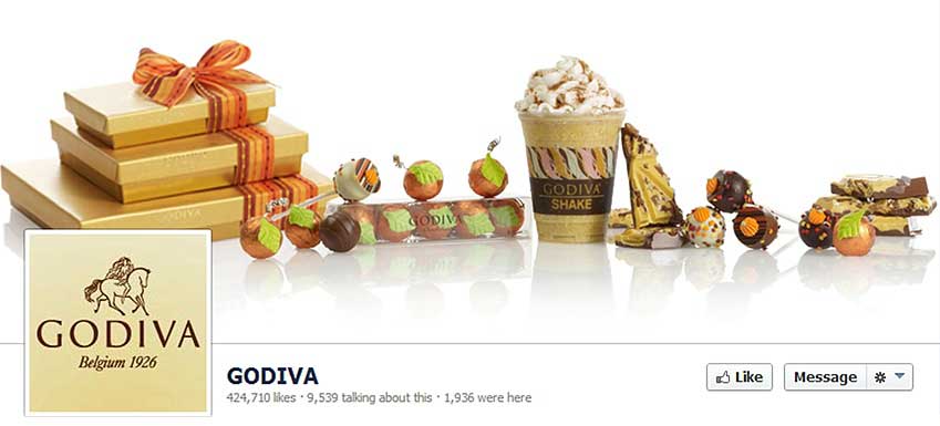
Another example of proper image use could be found on Godiva's Facebook page last fall. The company presented an assortment of delicious-looking Godiva foods and beverages that evoke decadence, luxury (gold colors), and the colors of fall. The image is properly sized and pixelated—obviously the work of a professional photographer.
It's the type of image you would expect to see on Godiva's page. But that doesn't mean you don't have room for creativity. Your Facebook cover page can send a different message than your posts, whether it's a funny subject or a caption, as long as it fits with the overall brand. So, if you offer high-quality copper cookware, for example, you could show an array of great dishes or even a food market, instead of yet another picture of a pot.
Ensure images work together
As a marketer or a member of creative staff, you always want to ask yourself whether an image is properly representing the brand, and whether it works in the context of the medium you are using.
If you are building a collage of images, they should share certain stylistic elements that hold them together; for example, they might all be black and white. The content of the images themselves should also be cohesive; for example, all of the people in the shots could be eating your brand's sandwiches, or they might all feature women holding Coach bags.
Photos that appear in print pieces, websites, and social sites should all share design cues and evoke certain brand sentiments. They are as important as your content when you are trying to build a consistent brand strategy.
Find images appropriate for social media
You should never use an image you "found" online via an image search. That's asking for legal trouble, and you won't find high-quality, high-resolution images. The right way is to hire a photographer to create original content or to use a stock photo service that offers a wide variety of images that fit many types of brands.
Before using a stock photo service and scouring for images, you should do some research into what types of visuals your audience enjoys. Take a look at some of your Facebook fans to see whether you can spot patterns among what other brands they enjoy and what types of imagery those brands use. Perhaps your audience enjoys travel and responds well to panoramic images of exotic locales. If you are a truck manufacturer, you might consider outdoors scenes, work sites, or groups of people with dirty work clothes that signify a heavy-lifting job:

Man in cowboy hat next to truck photo
courtesy of Dreamstime
The images you pick can directly showcase your product's or service's attributes, or they can be more about an emotion or connection to the brand.
For photos specifically meant for Facebook pages, you should keep in mind its dominant color scheme and pick photos that either blend into its chromatics or make an interesting contrast. You also need to consider the interplay between the profile pic avatar and the cover photo, because they should relate to each other. If that relationship can be established very creatively, then you will build some additional brand presence.
Social media's power is in the sharing of information, so pick images that can gain some traction among your prospective audience and their personal audience. Interject some humor or whimsy when it's appropriate to help set the brand apart and encourage sharing.
* * *
These guidelines aren't meant to stifle creativity; they are meant to serve as best-practices for brands that want to harness the full power of social media as a brand building tool.


