Animated GIFs pervade my RSS reader and make up at least 98.7% of every BuzzFeed list; they have even become currency in many company chat rooms and email messages.
Thoughtful, eye-catching animation in email has the ability to complement a marketing message rather than distract from it.
At Emma (where I work), we compiled content on how to effectively use GIFs in email marketing, including three customer examples. So here are three ways Emma customers have used animated GIFs to make their email campaigns pop.
1. Tell a story
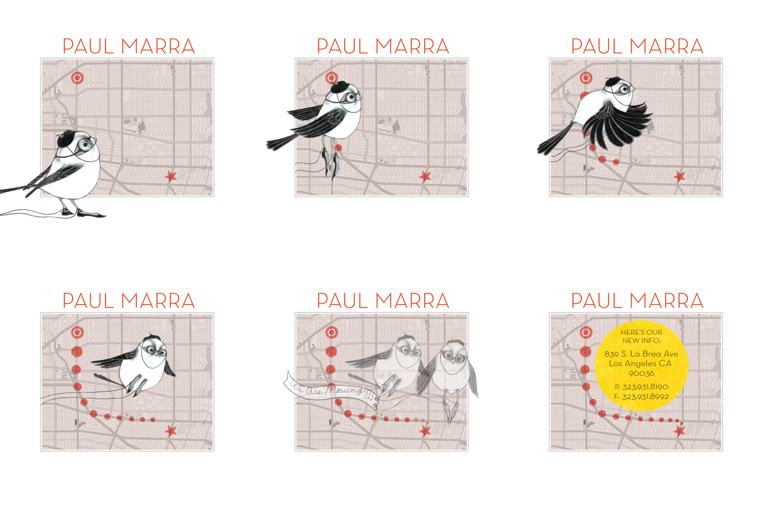
When Los Angeles designer Paul Marra moved his showroom to a new location, he used Emma to get the word out to his clients. The animated GIF tells the whole story, from the trail on the map to the "We've moved!" banner to the new address listing. It's lighthearted, stylish, and inviting.
See the GIF in action:

2. Draw attention to the most important thing
Emma customer Method is known for its use of coordinating color in product placement and text styles and white space to create an airy feeling in every email. In this email, Method used an animated GIF to draw focus on its 20% off promotion. It's subtle and completely in line with the company's aesthetic and does the job of drawing attention to the promotion.
See the GIF in action:

![]()
3. Show multiple products
If you're an online retailer, animated gifs can change the way email subscribers engage with your product. Consider this example from Emma customer Birds Barbershop: Isn't this animated image much more compelling than a static grid of hair products?

Here are 5 quick tips for using animated GIFs in email campaigns
- Keep your animation simple. If you can say the same thing in four frames that you can in eight, opt for the shorter sequence.
- Make sure your animation reinforces a major point of your campaign. If it's just for show, it's... well, just for show.
- Consider combining animated GIFs with Flash. If you've got a compelling Flash presentation on your website, put together a simpler version as an animated GIF. Include the GIF in your email, but link it to the page with the fancy Flash version.
- Try a simple test. If you're not sure whether animation will help you make your point, try sending an animated version to half your audience, and send a regular image to the other half.
- Watch your file size. We recommend keeping your entire email's size to under 40K so it's easily managed by servers and inboxes. Plan your animated GIF accordingly, and opt for simpler colors and graphics in your frames to keep the file size in check.
"Teamwork" image via Urs' Learning Journal.


