The first generation of landing pages was basic, almost cliché. They consisted of a headline, a few bullet points, a "hero shot" image, and a form. They captured leads with the promise of a whitepaper, webinar, or demo—or simply contact from a salesperson.
Those first landing pages weren't great. But they were the first incarnation of context-specific, post-click marketing, and they were effective enough to justify their implementation. And they hinted at more potential.
In 2008, with the publication of books such as Tim Ash's Landing Page Optimization and Bryan Eisenberg's Always Be Testing, the second generation of landing pages was born.
The two foundations of that era were...
- Widespread adoption of A/B and multivariate testing
- Portfolios of scores or hundreds of landing pages, each focused on tight "message match" with the ads or emails driving clicks to them
Best-practices began to solidify around form length, calls-to-action, and social proof. Software products appeared to help marketers manage their growing conversion-optimization programs. Eventually, almost every digital marketer acquired some experience with landing pages of that kind.
Now, a wave of new innovations in landing pages has raised the bar yet again.
Over the past year, a third generation of landing pages has emerged—let's call it Landing Pages 3.0—that incorporates ideas from content marketing, social media marketing, HTML5 interfaces, marketing automation, and the explosion of mobile marketing.
Let's take a tour of five defining features of Landing Pages 3.0.
1. Multiple Pages Providing Deep, Rich Content
The rise of content marketing has probably had the most influence on the recent round of landing-page evolution. Respondents expect more meaty content when they click through to a page—not just teasers for something after they convert.
One way marketers are meeting that demand is by deploying microsites. Yes, microsites. However, these are not the microsites of the Old Web, the overweight Flash productions that required expensive creative agencies to build.
The new breed of microsite is pure HTML, a collection of several pages linked together by a set of lightweight navigation choices. They load quickly, they're SEO friendly, and they can be built quickly and inexpensively.
For example, consider the following images of the first few pages from an Intuit microsite promoting its new GoPayment product (click to enlarge):
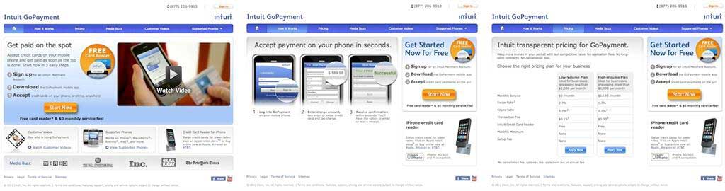
Like a traditional landing page, the goal of the Intuit microsite is to convince people to convert on a specific offer; In this case, sign up, and request a free card reader—a pretty straightforward call-to-action. In a previous generation of landing pages, the first page of this experience would have been sufficient: a video, a little teaser text, several social proof logos along the bottom, and a brightly colored "Start Now" button.
But with this six-page microsite, Intuit provides substantially more content to the respondent. The second page in this series shows a great visual presentation of how the product actually works. The third page delves into pricing details. Rates and fees are not relegated to the fine print; they're a featured piece of content here. Other pages in the microsite are dedicated to press accolades and customer testimonials.
Note that the call-to-action is propagated across pages, with the same language, imagery, and "Start Now" button. The purpose of that experience is the same as a single landing page—but with a lot more real content ahead of the conversion point. Even if visitors aren't ready to convert when they first visit, they can learn useful information about the product and form a strong, positive impression of the brand.
2. Compelling Design That Isn't Cookie-Cutter
For a long time, landing pages generally didn't look very good. Graphic designers and usability professionals were rarely involved in their production, mostly because they were built in the service of text-driven search marketing.
But with CMOs taking fresh interest in " customer experience" as the foundation of their brands—from the first touchpoints a prospect has with a company online—landing pages are undergoing a design renaissance. After all, in many scenarios, landing pages are the first impression potential customers have of your company. Don't you want to stand out from the crowd?
For instance, take a look at the first few pages of this microsite—another microsite-as-landing-page example—from the Centre for Arts and Technology (click to enlarge):

This landing experience, designed for potential students interested in fashion design and merchandising, lets visitors explore a program overview, career opportunities, and a list of courses. As in the Intuit example, this set of pages contains rich and detailed content. The call-to-action—again, replicated consistently across all pages in the microsite—asks visitors to fill out a short form to begin a dialogue with a program adviser.
The imagery—models showing off bold, new fashions—is not an afterthought, but arguably the very heart of these pages. The images communicate a visceral, visual message that mere words could hardly match. As an example of an increasingly popular Web-design technique, one primary image expands across the background of each page behind the text and the form. The image binds the entire layout together.
Yet, as impressive as the page layout looks, it's really not complicated. By displaying one good image per page, compressed for speed, and by including a couple of CSS styling tricks, each page delivers a high-impact impression using fairly simple HTML.
In other words, with a little bit of smart design input, any business should be able to produce landing pages of this caliber. Don't have a designer on your staff? Consider tapping into an online marketplace of freelance designers, such as 99designs.com.
3. More Interactivity and Exploratory Interfaces
Another way landing pages are becoming more interesting is that they are starting to incorporate more interactive and exploratory features as part of the user interface. Instead of simply presenting a linear piece of text, landing pages might encourage visitors to click on different elements on the page to identify what's most relevant to the visitor.
The simplest incarnation of that might be an embedded video that visitors could click to watch, or a "lightbox" that lets visitors zoom in on a particular image, or a simple layout of multiple tabs of content that break out the different features of a product. (The previous microsite examples are a little like that.)
However, the interactivity on landing pages can also be much more sophisticated. For instance, when Google—known for its relatively conservative user interfaces—launched Google Plus, it published a very cool landing page where people could learn about the new offering (click to enlarge):
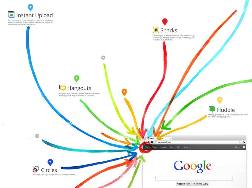
Seemingly hand-drawn colored lines emanate from different icons and labels, and visitors can pan out from and zoom in on the page, much as they might with Google Maps. When visitors click on an icon, a new layer appears on the page with details about that feature (click to enlarge):
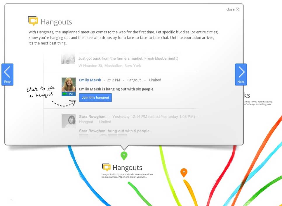
The page offers an engaging experience that helps prospective users to quickly discover what Google Plus has to offer.
Of course, not every landing page needs to take its user experience quite that far. For a good example of an exploratory interface that is impressive but much easier to produce, consider the following images of a microsite-as-landing-page used by Dell (click to enlarge):
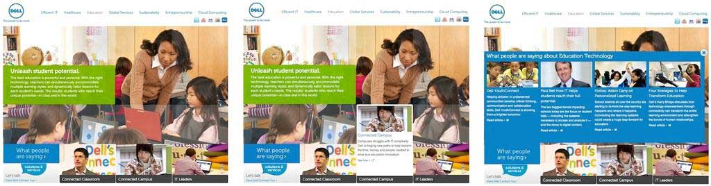
The microsite is organized around vertical markets, such as education in this example. Each vertical market page includes several subtopics—such as "Connected Campus" in the second screenshot—that display a brief description and a link to more information when users hover over them. Clicking on the "What people are saying" icon opens a new layer over the page with snippets and links to customer endorsements and other kinds of social proof.
Again, although those features look impressive, the HTML and CSS used to implement them is relatively straightforward. Open source JavaScript libraries, such as jQuery UI, have made such advanced Web-based user interface elements largely plug-and-play.
4. Social Media Integration and Micro-Conversions
No aspect of digital marketing has escaped the impact of social media. Landing pages are no exception, and their integration with Facebook and Twitter is now common. Consider this example by Blue Cross Blue Shield of Georgia (click to enlarge):
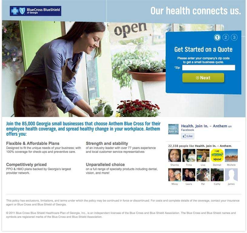
Although the primary call-to-action on this page is the "Get Started on a Quote" form near the upper right corner, the option to "Like" the company's sponsored health community on Facebook is a prominent secondary call-to-action. The "Like" option also doubles as a form of social proof, displaying others who have joined.
Such "Likes" and "follows" have become a new kind of micro-conversion, a low hurdle for visitors who are interested in your offerings but who may not yet be ready to take the primary call-to-action. By joining your social network, however, they can stay in the loop and learn more about you over time.
For visitors who are ready to move forward, a social micro-conversion doesn't have to be a disruptive detour. Because Likes and follows happen in-place, via JavaScript, the user stays on the page and can immediately continue on to the primary call-to-action.
Most Web analytics packages, such as Google Analytics and Adobe SiteCatalyst, let you track such social micro-conversions as page events. That's important, especially when you're A/B testing different page designs, because it allows you to weigh their contribution as part of your overall performance metrics.
Note that sometimes social share buttons can make sense on the "thank you" page of your landing experience, after visitors have converted. If your offer (e.g., a webinar) is something that the respondents might deem socially beneficial, they may well consider sharing it with friends and followers.
5. Mobile Accessible in a Multi-Device World
Because of the proliferation of smartphones and tablets, a growing percentage of traffic to landing pages is via mobile device.
In the case of visitors who arrive via tablets, primarily the iPad, you won't have to do much. Generally, your desktop-sized landing pages will render beautifully as is.
However, because the iPad does not support Flash, avoid Flash elements on your landing page, including Flash-based video players. That's not so problematic, however, because almost all Web-based interactive features—such as those described earlier in this article—are implemented using CSS and JavaScript, which work fine on tablets.
Smartphones are a little more challenging because although they can render regular, full-sized Web pages, they require visitors to do a lot of zooming and scrolling with their fingers. That can be a bit frustrating, which is not how you want your respondents to feel.
You can accommodate smartphone users who visit your landing page in two ways. The first is to implement the CSS and HML of your page so that it automatically reflows and adapts itself to the size of the user's browser. Though that solution allows the same page to serve all users, it can also impose constraints on your design and content that may be less than ideal. When A/B testing different designs using this solution, you may find that one design is better for mobile users whereas another is better for desktop users.
A more flexible solution is to implement a separate, simpler page specifically for mobile visitors, such as the following example by Overland Storage:
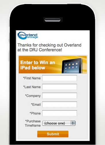
On your primary landing page, you can redirect visitors who have a mobile "user agent" identifier—e.g., iPhone, Android, Windows Mobile—to the version that is built for their device. (If you're driving traffic from mobile ads, you can skip the redirect and link directly to the mobile landing page.)
The advantage of using two pages—one for smartphones and one for everyone else—is that it lets you tailor the experience on each device without sacrificing the native properties of either. You can run independent A/B tests to optimize each.
For instance, your mobile version might apply a much simpler design, incorporate more one-click choices (because clicking is often easier than scrolling in that context), and emphasize phone numbers that enable instant click-to-call shortcuts.
* * *
Join Us for a Landing Pages 3.0 Webinar
If you're excited about the five features of the Landing Pages 3.0 generation, please join us for a MarketingProfs webinar on November 10. We'll delve into some of the examples in this article, providing plenty of tips and tricks for how to adopt techniques relevant to your own landing pages and post-click marketing.
(Image courtesy of Bigstock, Waterhole Landing.)