In day three of our five-day crash course on conversion, we covered why your homepage is likely not the right choice for conversion success, and four reasons why you'd want to avoid using it as your landing page. In part four of our conversion series, you'll learn how landing pages can be a pivotal way to keep campaign messages aligned from ad to page
Day 4: An Introduction to Landing Pages
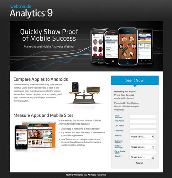
Technically speaking, a landing page is any page on your website that customers arrive at or "land" on. However, for the purposes of this crash course, when I say landing page I'm referring to a page that is created as a standalone entity—a campaign or promotion specific page—designed to be free from the shackles of your homepage (as identified on day 3).
Standalone landing pages have a few general characteristics:
- No global navigation. Customers are prevented from wandering off the conversion path.
- Single entry paths. The pages are accessible only via a promotion- or campaign-specific marketing link (e.g., social media, PPC, email, banner ad).
- One conversion goal. The page has one purpose and usually a single, primary call to action.
A good example of a standalone, campaign-specific landing page is this one from Webtrends:

The Benefits of Landing Pages
As noted earlier, landing pages remove the restrictions and complexities of your homepage. They can also improve your conversion rate in the following ways:
- Improved message match. When you design a page with a single focused message, you create a simplified experience that better represents the expectation created by your upstream ad.
- Improved quality score. A focused message improves visitor conversion behavior; as a bonus, pay-per-click engines (such as Google AdWords) like it better, too. A higher quality score can reduce the cost of your paid advertising.
- Separation from primary site architecture. By removing your landing pages from the main site (setting them up on a sub-domain), you can empower marketers to manage their own operations and be more agile and responsive.
- Easier to test and optimize. Technical and architectural separation lets you run optimization experiments (A/B or multivariate testing) without impact on the rest of your site.
- Improved measurability via segmentation. An advanced strategy is to create a separate landing page to segment each of your inbound traffic sources. Doing so simplifies your metrics and allows you to see which channels perform the best for your audience. Most important, it allows you to test different ideas, messaging, and content appropriate to the channel (e.g., social media widgets for your social media traffic) without affecting the conversion rate of your other channels.
A good example would be if you were changing your page to improve email conversions. Doing so, however, might affect the quality score for your PPC campaign by knocking the message out of sync with your AdWords ads. Segmented landing pages avoid that problem.
Landing Pages vs. Homepages
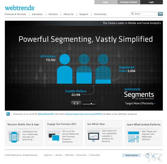
To better understand those benefits, compare the Webtrends homepage (below) with the landing page shown above.

The homepage is beautifully designed, but it's also (necessarily) focused on multiple things. Five concepts are presented in the main promo area (via the rotating banner), four supplementary messages below that, and a total of 25 interaction points. All that makes for a great destination for branded organic search traffic, but it's not as good as the landing page for driving traffic targeted on a single topic.
Day 4 Resources
Several landing-page tools are available for creating (and testing) landing pages. Here are two:
- Unbounce lets you easily create and A/B-test landing pages without help from IT. It is designed for the small-to-midsize business market (disclaimer, I'm a co-founder).
- LiveBall. Like Unbounce, LiveBall is an all-in-one platform that lets you create and test landing pages. It focuses on enterprise and agency clients.
Day 4 Task
Check your message match. Take a look at your current marketing initiatives (PPC, email, banners, social media), and compare what they say with the first thing you see when arriving at your homepage.
Start thinking about how landing pages could allow you to have multiple, simultaneous campaigns and still keep the messages aligned from ad to page.
MarketingProfs Resources
- Website Conversion Success Stories—11 case studies (publication)
- Take 10: Crank Up Conversions With Your Facebook Welcome Tab ( online seminar)
- Advanced SEO Strategies for Higher Rankings and Conversions (online seminar)
- The Seven Deadly Sins of Landing Page Design (online seminar)
- Sure-Fire Tips for Increasing Your Web Conversions (online seminar)
- Demolish the Roadblocks on Your Website: Clearing a Path for Customer Action, Sales and Loyalty (online seminar)
- High-Performance Landing Pages that Boost Your Bottom Line (FREE) (online seminar)


