All forms of direct marketing are, by nature, testing intensive. Every aspect of an effort—from the headline to the teasers to the offer to the packaging—should be tested and retested to ensure maximum impact. Email allows that testing to be taken to new heights.
Because it is uniquely interactive and fast, email is arguably the most powerful medium available for fast, thorough testing. In fact, the immediacy and interactivity of email can provide almost instantaneous feedback from recipients. There is no reason not to test before almost every mailing. Even a simple, small test of subject lines can drive major changes in response.
Setting Up a Testing Program
Not every part of every message needs to be—or should be—tested with every mailing. Be strategic by testing specific components periodically. We recommend starting with those tried and true items that have consistently been among those tested most often in direct marketing for years—more specifically, the teaser, the headline and the offer, since these are often the three most powerful elements in motivating a reader to take action.
A word of warning: Don't use your entire customer base as a test market. The sheer volume may make it impossible for you to accurately determine which variables are working better than others.
Instead, set up standing selects of addresses that are reserved for testing. This limits your risk and still enables you to test extensively. Depending on the size of your list, testing should be done on no more than 10 percent of the list. So, if you have a list of 30,000 names, select three sets of 1,000 recipients from your list. Send your message with a different subject line to each list. By monitoring the open rates, you'll know within a few hours which subject line is getting the best response. Then, using that subject line, send the mailing to the remaining 27,000 subscribers.
Think about it: In about an hour, you can greatly improve the success rate of your campaigns at no additional expense. This example is so simple and effective, there's no reason not to do this every time.
Considering all of the elements that go into an email newsletter, you have an unlimited number of variables that you can test. But here are some of the more important ones on which to focus your attention:
Subject Lines
As we mentioned earlier, this is a quick, easy and powerful way to increase the effectiveness of your email. From a traditional advertising or direct mail perspective, it's like being able to test multiple headlines or envelope teaser lines—only it's dynamic, so you can test it directly with your subscriber base and make well-informed decisions mere moments before launch.
Subject line testing idea: You can also use search engines to test subject lines. This method does come with a cost, albeit a low one since most search engines let you buy cheap pay-per-click listings. Here's how: Create 5-10 subject lines for the same offer and list them all simultaneously on a search engine, using the same search term. Then simply track which one gets the most clicks. Usually, the phrase that wins in a search will be the most effective in an email.
Offer Sequence and Placement
Try putting different offers in different places throughout the newsletter. This will help you determine where to place your most important items. Some spots—like the upper right hand corner—tend to get more clicks, but you'll only find out what works best for your design by rotating your offers.
This is an old trick of Web site editors—place links to the same article or feature in several spots with varied headlines and see what works best, then optimize around it. You can use this same strategy for email. Try some at the top, some at the bottom, some on the side, and see which spots pull best. Then reserve those spaces for your most important offers. We've found that placement sometimes matters more than the offer.
Number of Offers
Direct marketing norms stipulate one mail, one offer. That holds true in email and current trends show response rates increasing with fewer offers per email. This is most likely due to the basic fact that clutter is confusing. But consumer response regarding the best ratio of offers to email changes rapidly, so frequently test new combinations of content, offers and offer quantity.
Always consider your audience and your level of trust, as well. Parenting sites, for example, can usually have lots of different types of content and offers because moms have a variety of needs related to taking care of children. On the other hand, business-to-business marketers usually need to stay focused on one topic to hold the attention of busy executives in their target market. To do this test correctly, keep your templates consistent. This will allow you to compare apples to apples. Then you can start modifying the offers and their placement.
Mailing Frequency
How often you mail is often determined by your content. For example, if you're sending out top headlines, you'll want to mail daily. If you're providing "Things to do on the weekend," then weekly is the obvious frequency. But since most content isn't so clear-cut, you don't want to guess on this aspect. For starters, always ask subscribers their preferred frequency when they sign up.
Timing of Your Mailings
Believe it or not, even the time of day can have a major impact on results. Depending on what you're marketing and the type of content you're distributing, it may be more to your advantage to mail first thing in the morning, or near the close of business. For example, many e-tailers find that they get great bumps in sales if they mail right before lunch because lots of folks spend their lunchtime running personal online errands, such as buying gifts, ordering books, planning trips, etc.
This maybe due in part to issues with deliverability. We recently found that delivery rates across the top ISPs vary with time and day that mail is sent. For example, 9 a.m. to 3 p.m. Eastern time, showed a drop in deliverability—a time when SpamCop finds the highest incidence of spam reporting. Find a balance between optimum response and deliverability for your audience.
Here's an easy way to find out what will work best for you: Divide your list into 10 parts and send the same message at 10 different times throughout the week, tracking which gets the best response. It's easy to do, and even a 1% jump in response can make a serious dent in the bottom line. Repeat this test every three or four months.
Content Length and Order
The ideal length and number of stories for your email newsletter program varies by what your particular audience prefers. Try one story of about one paragraph in length by itself and then try the same story with several promotional add-ons. Then review your readers' responseS by measuring click rates and pass along rates. Ask for feedback, as well.
And don't forget about wording. Some words and phrases just pull better than others, whether as subject lines or as headlines in the email. For example, the editor of a prominent content and community site once tested the headlines "Celebrate the Holidays" and "Celebrate Christmas." Both linked to the same exact page, but the second one got a far higher number of clicks. You can do tests like this in your emails and on your Web site to determine what words hit your audience's hot buttons.
Landing Pages
Always use a custom landing page that highlights the specific offer and streamlines the call to action. Never dump folks onto your home page and expect them to navigate themselves to the information or offer promised in your email.
Think about when you call an 800 number to purchase a product. The operator who answers the phone doesn't simply say "Hello." No, they are prepared with scripted greetings that help guide the caller through the purchase process. For every offer, test multiple versions of the landing page, each with variations in copy and design. Even a 5% jump in the close rate will make a big difference in your bottom line. A slightly better landing page can change the story of your entire email campaign.
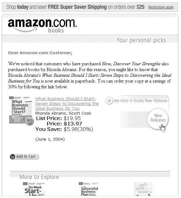
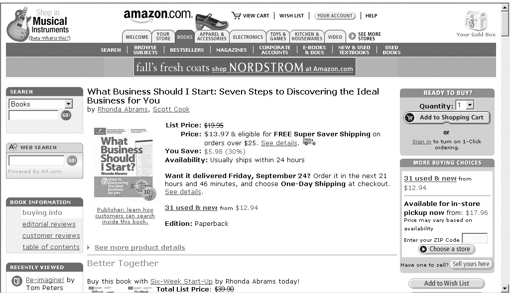
Amazon.com does a great job connecting its email promotions and landing pages, both from a writing and a design perspective.
The email (figure 1) carries the more recognizable elements of the Amazon.com site, including the logo, "Your personal picks" recommendation and the ever-recognizable "Add to Cart" icon.
Once people click on the book, book title, or the "Add to Cart" icon, they are taken to the landing page (figure 2), where they are greeted by the familiar Amazon.com bookstore page. This smart execution creates an almost seamless transition that makes the purchase process fast and easy.
Newsletter Designs
A design that is unattractive, cluttered, clunky or otherwise hampers readability will work against you. Try sending the same content plugged into several different templates to three groups of test subscribers with a survey asking their opinions on the design. Then, review the survey results with the response rates of each template to determine which design is most effective.
The moral of the story? Test, test, test. Test every aspect of your email campaign—particularly those outlined above—on an ongoing basis. Considering the speed with which you can obtain and act upon the feedback, there's simply no reason not to.
This article is excerpted from Sign Me Up! A Marketer's Guide to Creating Email Newsletters That Build Relationships and Boost Sales. For more information on the book, visit www.returnpath.biz/signmeup. * * *
Editor's Note: If you are looking for a testing tool, check out TestLab. MarketingProfs recently introduced TestLab, a tool that makes it easy and economical to run live experiments by presenting your site visitors with alternative content—like different pictures, copy or prices—and measuring their response in real time. For more information, visit https://testlab.marketingprofs.com/info/.


