Two might be company in life, but in communication you can go all the way to three and still have a rollicking party. If you step over to four however, it's quite likely that you've stepped into the harakiri zone. Back up that truck a bit and learn how the limit of '3' has the ability to make your communication soar.
Let's Start With a Little Test…
Here's a psychological test. Lay out 10 business cards in a row and choose three that catch your attention instantly. Now don't cheat. Do this before you continue reading this article and you'll be quite amazed at the results.
So What Did You Find?
Isn't it strange that there seems to be no real reason why you chose what you did? There doesn't even seem to be a very clear pattern emerging. Some of the cards have lots of information v/s some that have very little. Some are colorful and others are not. Yet something has drawn you to play devil's advocate and reject some of them outright. Could that something be a deep-rooted psychological trigger embedded into your subconscious? And how can this trigger make such a dramatic difference to your communication and marketing?
Aha! You've just run into the magic of THREE. Understanding and applying it will throw a flashlight into the dark world of your presentations, brochures, web sites and yes, even email! Before you put this into the "This is for my graphic designer" basket, read further because it will help you recognize the psychological background of how the brain understands these things and reacts to them. It also helps you clean up your every day communication that your designer might never get involved with.
How the Brain Sees Things
The brain finds it relatively easy to grasp three elements, colors, fonts etc. Push that marginally up to four and it gets confused where to look and what to do and sends the eye scampering like a frisky puppy on a sunny day.
So why does this happen? For that we might have to go back a little to diaper country. As a child, everything you did and learned seemed to be centered around three. A,B,C, 1,2,3, three blind mice, three musketeers, trinity, three stooges and Huey, Louie and Dewey (Quack! Quack! Quack!)
Then again maybe these writers, animators and wise men understood the ease with which we understand 'threes' and reconstructed their work to fit this paradigm.
The Lego of Visual Communication: Elements, Fonts, Colors
Most visual communication can be reduced to these three features:
Elements, Fonts and Colors. Understand how they work and you've given yourself the added advantage of a mini design degree.
Just What are Elements?
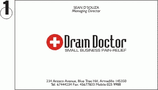
I'm assuming you've got rid of those business cards in front of you so I've made up some of my own to illustrate the point of elements. Elements are simply a group of objects, grouped together to form a common definable form. For instance, your eyes, nose, mouth and ears are the main objects that form the element called the face. Let's look at the cards below to understand this even better.
If You Look at Card# 1, You Will Spot 3 Elements:

1) The name and the title of the person
2) The logo, the logo font and the service description
3) The contact details form the third element
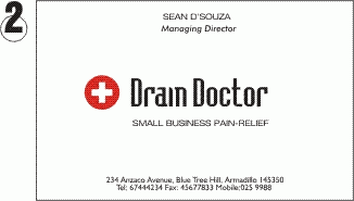
If You Look at Card# 2, You Will Find Very Subtle Differences.

All I've done is moved the text and logo just a tad bit around. However, even that tiny displacement has ADDED a series of unwanted elements. Suddenly it appears there are 5 or even 6 elements.
1) The name
2) The designation
3) The logo design
4) The logo font
5) The service description
6) The contact details
Card# 3 Gets Even Harder to Focus On… Guess why.

Card#3 is all over the place, as it has not only violated the rule of elements, but also complicated the visual layout with additional fonts (It has 5 fonts). Learning how to manage fonts makes a big difference to your layout and the overall look of your project.
Here a Font, There's a Font, Everywhere a Font, Font
There are zillions of fonts out there today and it's hard to restrain yourself when you're putting together a document. Try and use not more than 3 fonts on any communication. The more fonts you have on a page, the harder it is to actually read what you're saying. Be aware that a font that is in italic visually ends up looking like another font altogether. It adds to the elements and clutters it up considerably.
Also determine what the font really is doing for your document. You might want to create some drama and use contrasting fonts (fonts that are vertical when used with fonts that are wide contrast well).
I'd also recommend you read 'The Design book for Non-Designers' by Robin Williams. It's an inexpensive, easy to read book that clearly explains the different facets of fonts and their usage plus how to use fonts to set the mood.
Seven Colors are for Rainbows
Whether it's a t-shirt, brochure, website or business card, it's important to restrain yourself. Color managing your palette with just three colors can often provide a feeling of as many as five or six colors, when moved around a bit.
Count shades of colors as two colors. So red and dark red are not just one color but two definite shades and hence two definite colors. So be clear about the colors you are choosing. Say you choose something like red, black and green. Move that round a bit and you can get bright communication without the confusion.
Why This is Important in Marketing and Business Communication
Most of us are always presenting or selling to someone else. The proof of the pudding is always in the eating, but the taste buds start to salivate only through when it looks really YUM! If you choose to ignore the psychology behind this, your 'dish' might taste wonderful, but you may never get someone to stay long enough to eat.
This also helps you keep a check on your designers. Most designers instinctively get this right, but sometimes they goof up big time. You can run this audit past your marketing material and check for elements, fonts and colors.
Having said that, a competent designer might have the innate ability to break rules and if it works, that's OK. Nothing is that sacred, but it helps to know the reasoning behind it. Besides you now have the ability to make that designer sweat a bit.
Heeeeeeeeeere's some Examples!
McDonald's: The McLogo consists of two elements-The name McDonald's and the Big Yellow arcs. In terms of fonts, they use just one font. colors are just two-Yellow and White(or black)
Coke: The Coca-Cola button that you see in most advertising, consists of three elements: The button itself, the bottle on the button and the Coke Logo. Even though it is a full color image, the colors are minimal and there is just one or two fonts used.
Now that you can see the forest for the threes…:
Go out and look at advertising. Revisit your brochure. Audit your presentation. Streamline that website. You will be appalled at how much clutter you had to start with and how easy it is to smarten it up quickly and efficiently.
Your marketing message will be much tighter and more professional but best of all you'll know you're doing something that's deeply embedded in the psychological psyche of humans.
May the 'fours' be with the reckless Luke Skywalkers of the universe. You'll find it pays to stick to the threes!


